


Project Overview
Project opportunity
Sescom evolved from a local, operational company into a partner serving international retail chains across Europe. The brand had strong business fundamentals, recognition among existing clients, and a distinct competitive edge: combining operational scale with a local, relationship-driven approach. The problem, however, was inconsistent communication and a lack of a visual language to support this ambition.
Sescom's image was perceived as chaotic, inconsistent, and overly 'operational' — it failed to reflect either the team's quality of work or the European scale of the business. The brand itself was described as experienced and committed, but at the same time, lost, overly complicated, and difficult to grasp.
247 solution
We created a complete visual identity system based on the idea of continuity and flow.
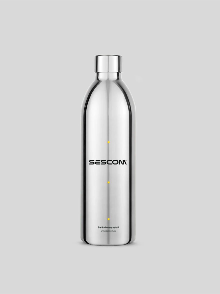
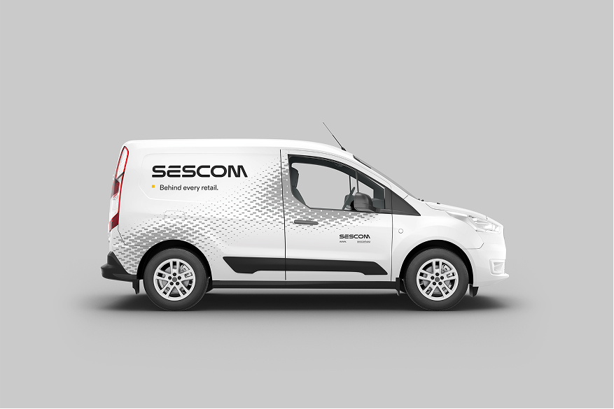
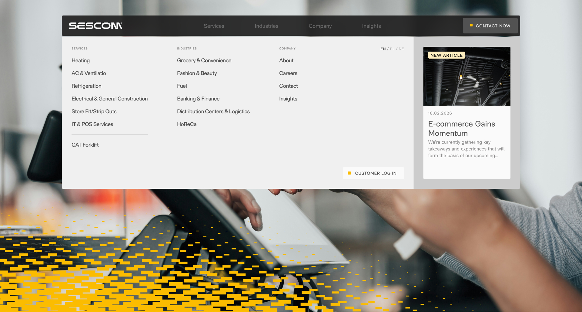
The new Sescom logo was simplified and refined to better reflect the brand's modern, European character. We ensured it was legible, scalable, and performed well across both digital environments and physical media — from technician uniforms to fleet branding.
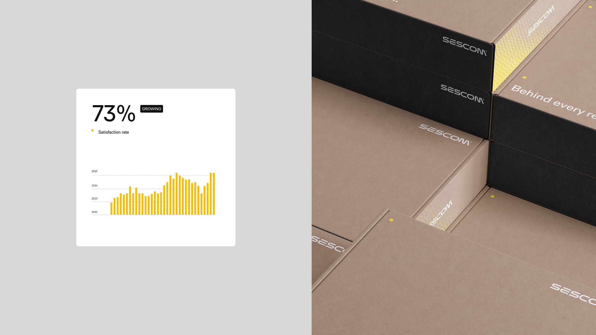
The starting point for the entire visual language was a modular pattern based on a rounded square. We developed it through a series of transformations, creating a dynamic system that can function as both a subtle background and a dominant communication element. The pattern symbolizes a network of connections, continuity, and Sescom's ability to combine local operations with a European scale.
We complemented this with an isometric illustration system, which allowed us to translate complex processes and the brand's operational areas in a simple and clear way. This provided Sescom with a tool to communicate its offerings, technology, and operational scale without relying solely on stock photos or technical jargon.
We completed the package with a cohesive layer of motion design. The animations were designed as a natural extension of the pattern and visual system — calm, fluid, and modular. This allowed the brand to truly come alive digitally and on the website, while maintaining a professional and organized character.
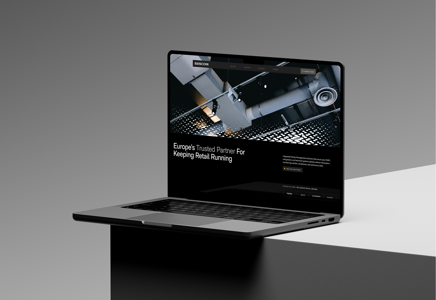
In parallel, we developed a new website that streamlined the information architecture and translated the new strategy and visual language into a user-centric experience. The website was designed not only to present offerings but, more importantly, to build trust, showcase the scale of operations, and clearly explain how Sescom differentiates itself from global FM corporations.
Project result
The project resulted in the creation of Sescom's first-ever cohesive, scalable visual system, which organizes the brand's communication across all touchpoints.
The new identity allowed the brand to transition from the image of a local, operational contractor to the role of a modern, European partner for retail. Sescom gained a visual language that distinguishes it from competitors, better communicates its unique advantage, and provides a solid foundation for further development — both in digital and in new European markets.


.svg)
