


.svg)

Project Overview
Project opportunity
The dynamically changing architectural market made Roark Studio need a new quality of communication. The key was to create a coherent visual identity that would highlight the professionalism of the studio and its distinctive approach to design. The team also needed modern, visually appealing presentation tools — intuitive to use and at the same time highlighting the quality of their work, and a new website, in line with contemporary standards and reflecting Roark's philosophy: modern architecture, created in dialogue with the place and its history.
247 solution
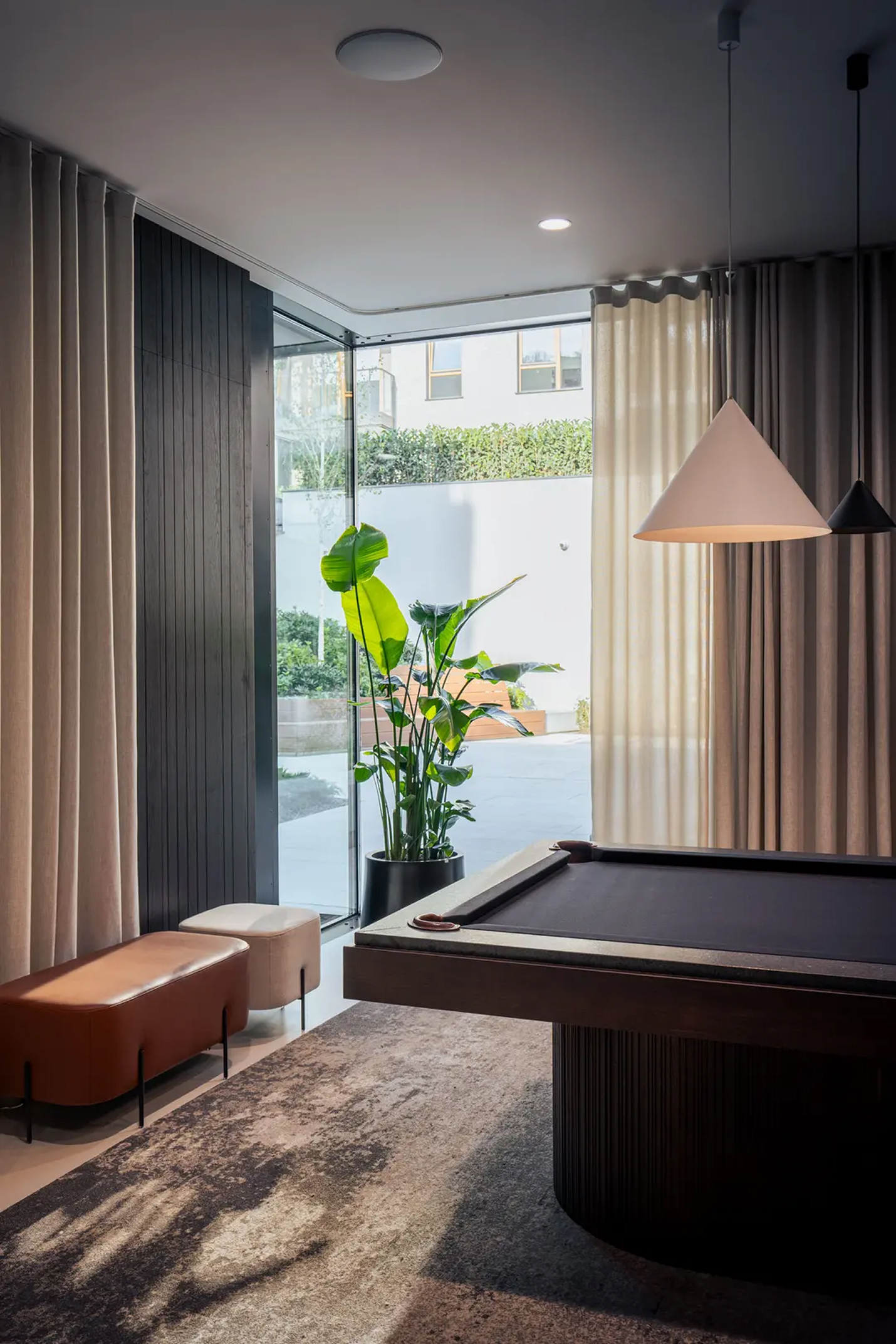
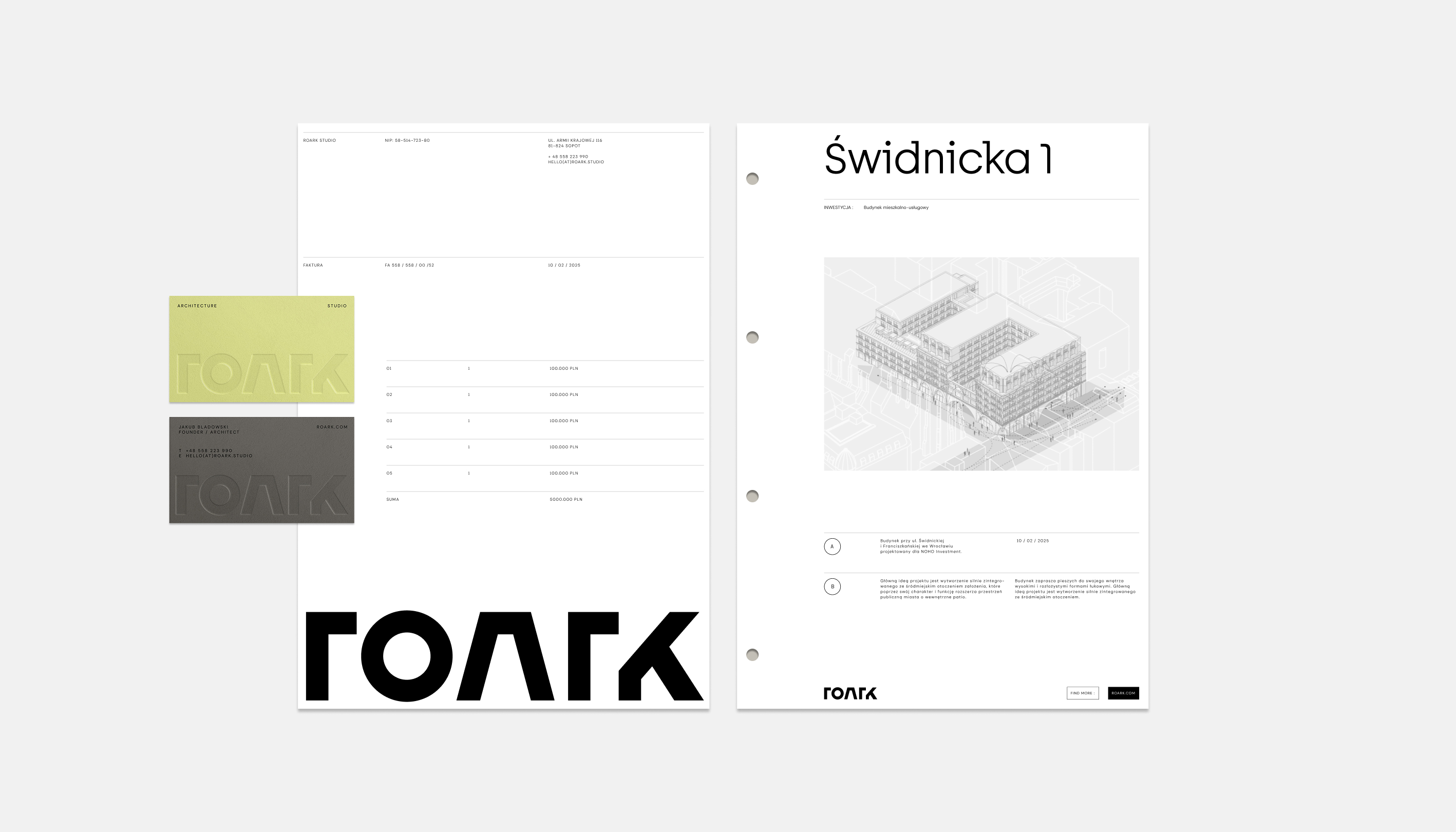
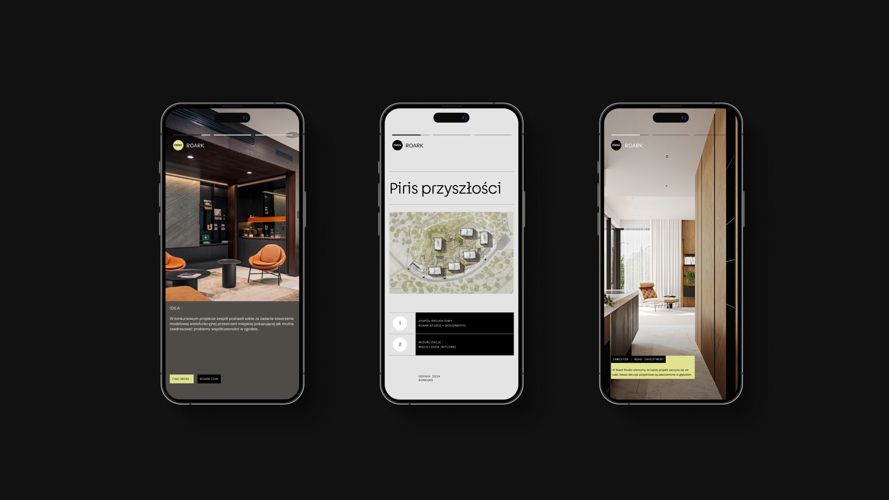
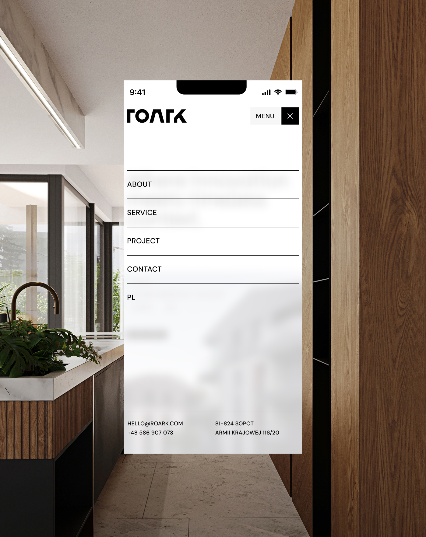
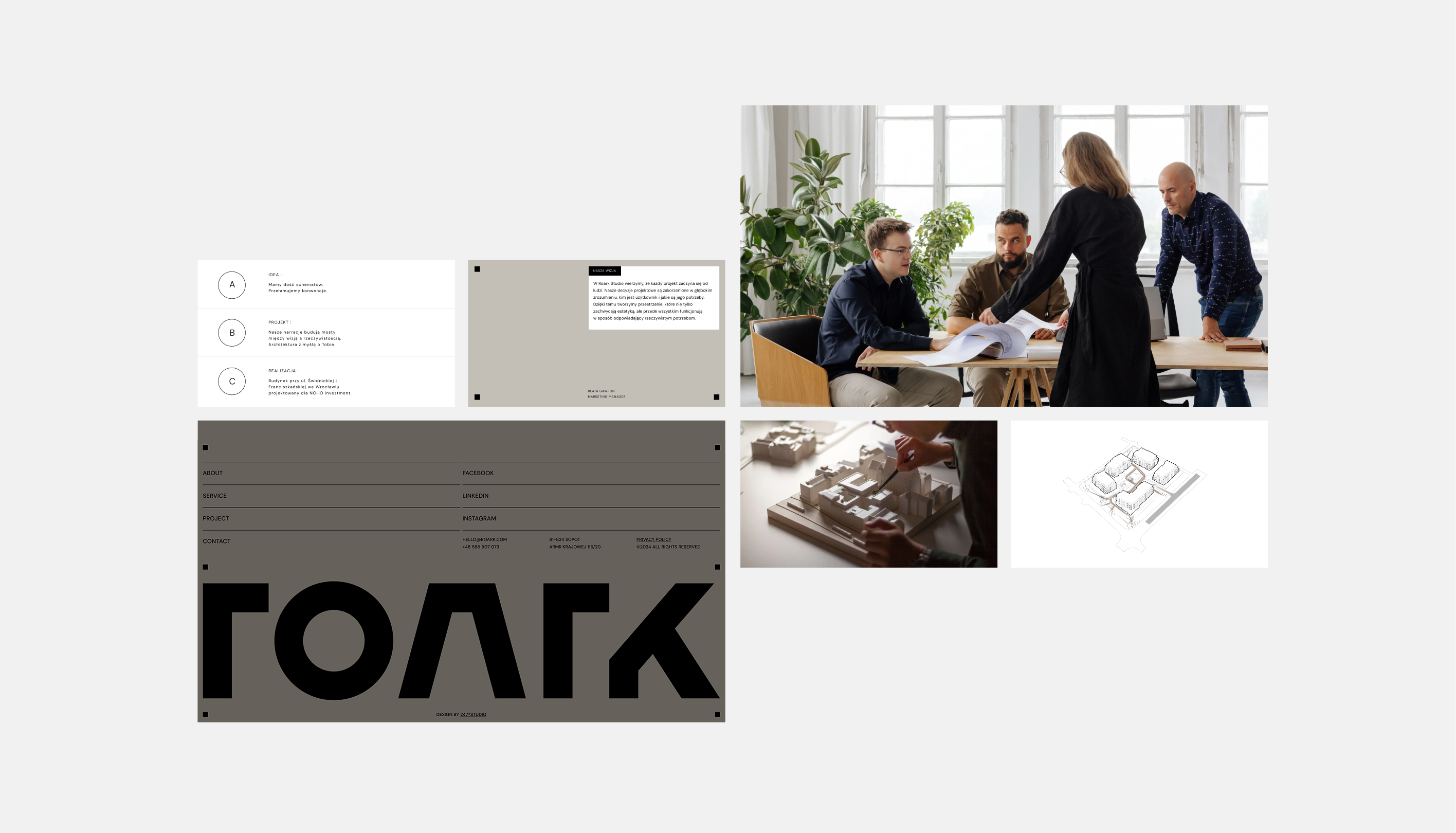
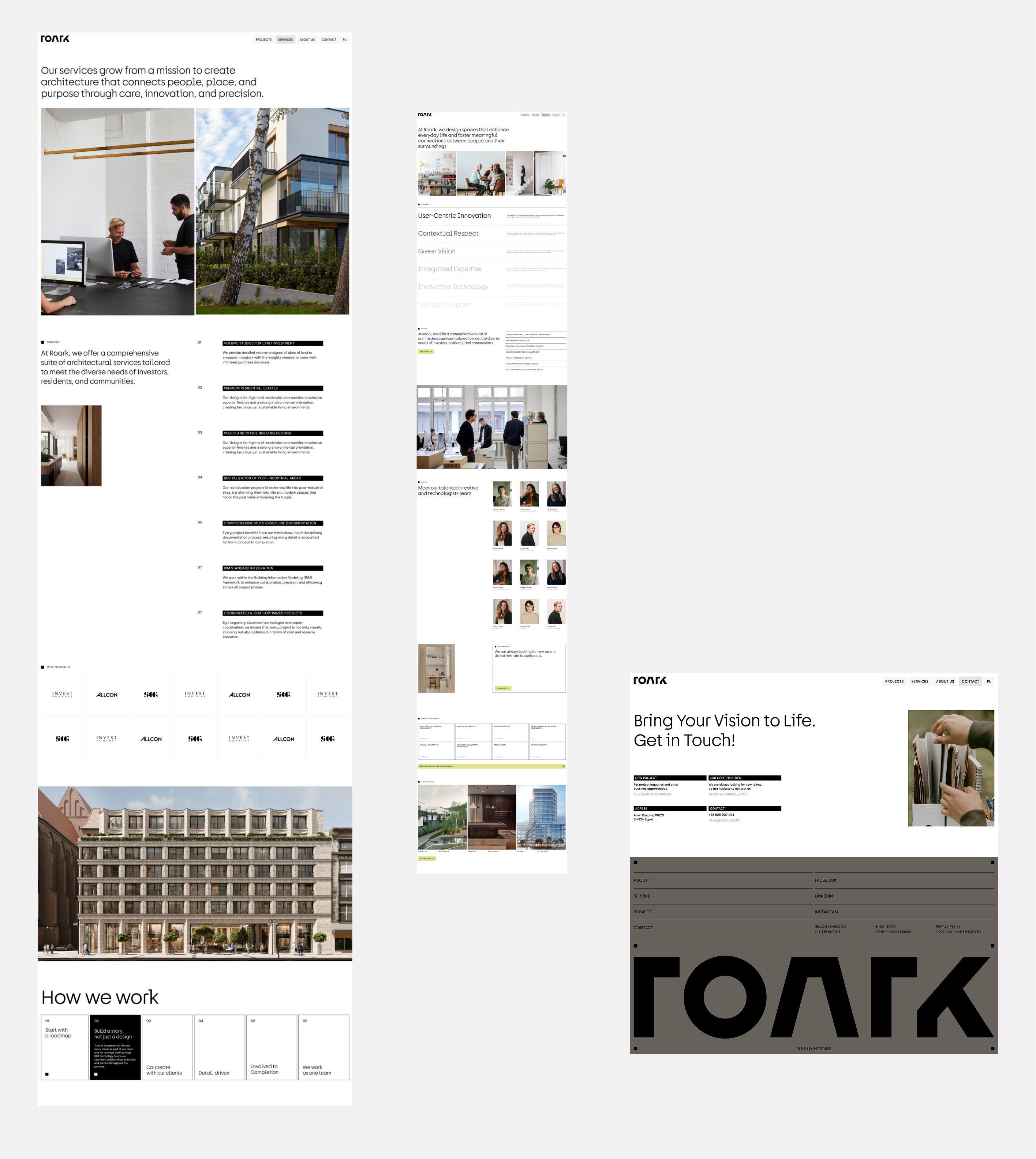
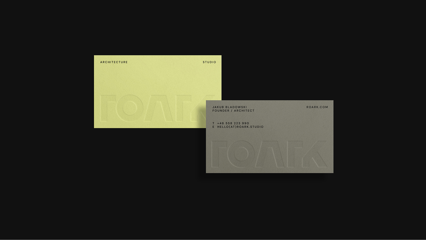
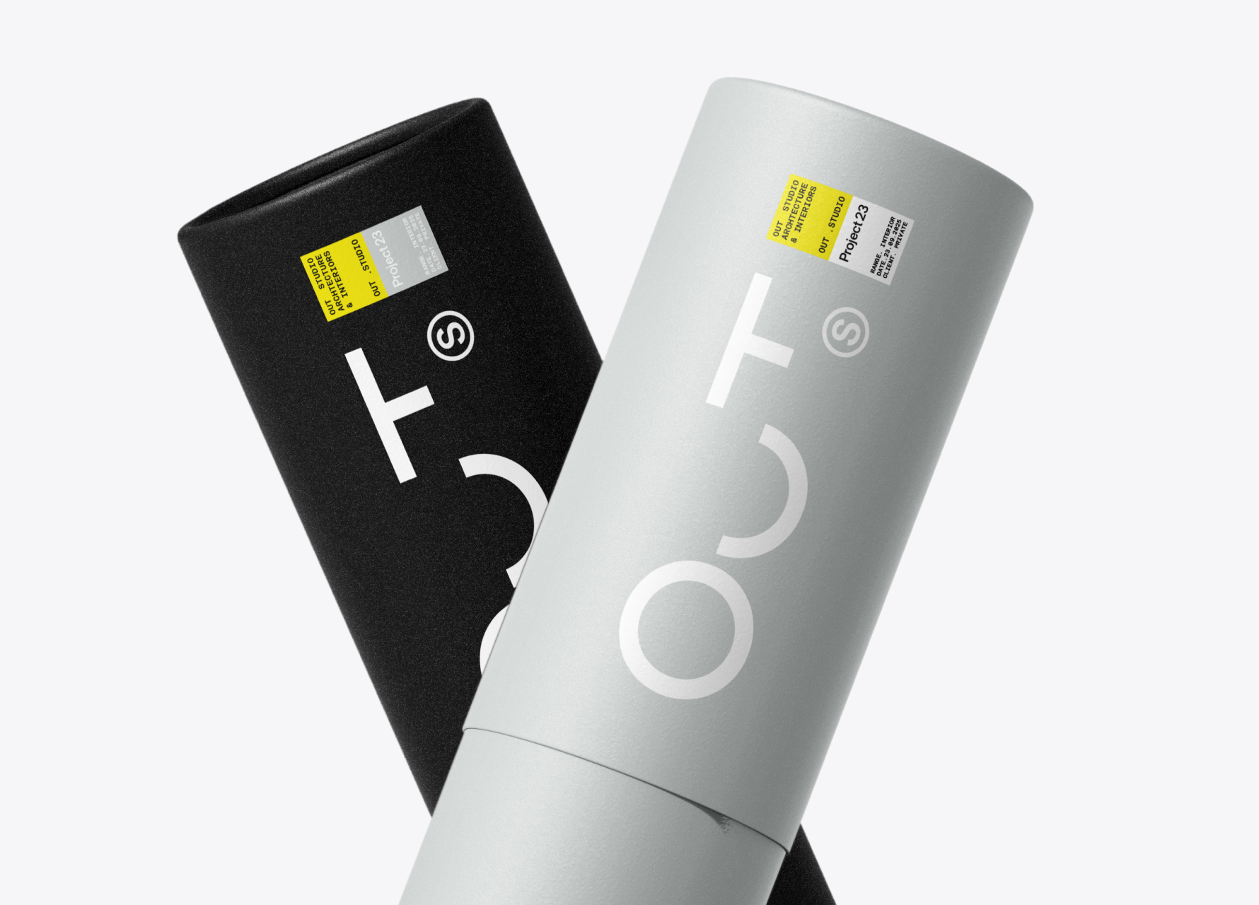
We proposed a comprehensive rebranding process, in which we created a new logo and visual identification system, based on simple, strong forms and elegant typography. We have defined the color palette and visual language that captures the character of the studio — minimalist, orderly and at the same time expressive. We designed and implemented a new website, based on a clear layout and full-screen photos of the implementation, taking care of responsiveness and easy content management to make the site a practical, everyday tool for team work.
Project result
The result of our cooperation is a modern, consistent brand that fully reflects the philosophy and character of Roark Studio. Rebranding organized communication, strengthened the image of the studio and clearly emphasized its professionalism. The new visual identity and website have become tools that really support business — they allow you to present your portfolio more effectively, communicate your offer clearly and build a stronger position in the market. Thanks to the modern technology we use, the site provides instant loading of content, despite the large number of photos and videos, which further improves its visibility in search engines. Thanks to this, Roark gained the foundation for further development and a visible advantage in its category.


.svg)
