.svg)


.svg)
Project overview
Challenge
HRnest is a company that has been supporting HR departments for years in organizing HR processes — from working time records, holidays, to documentation management. As the brand strengthens its position in the market and develops the product, the existing website has ceased to meet the needs of the brand — both visually and functionally. The client needed a new website that would not only reflect the fresh character of the brand after the rebranding, but also present the complex functions of the system in a clear and engaging way. The key was to design a logical information architecture, ensure clear communication and create a website that supports the user in making the decision to start testing or purchase the tool.
Solution 247
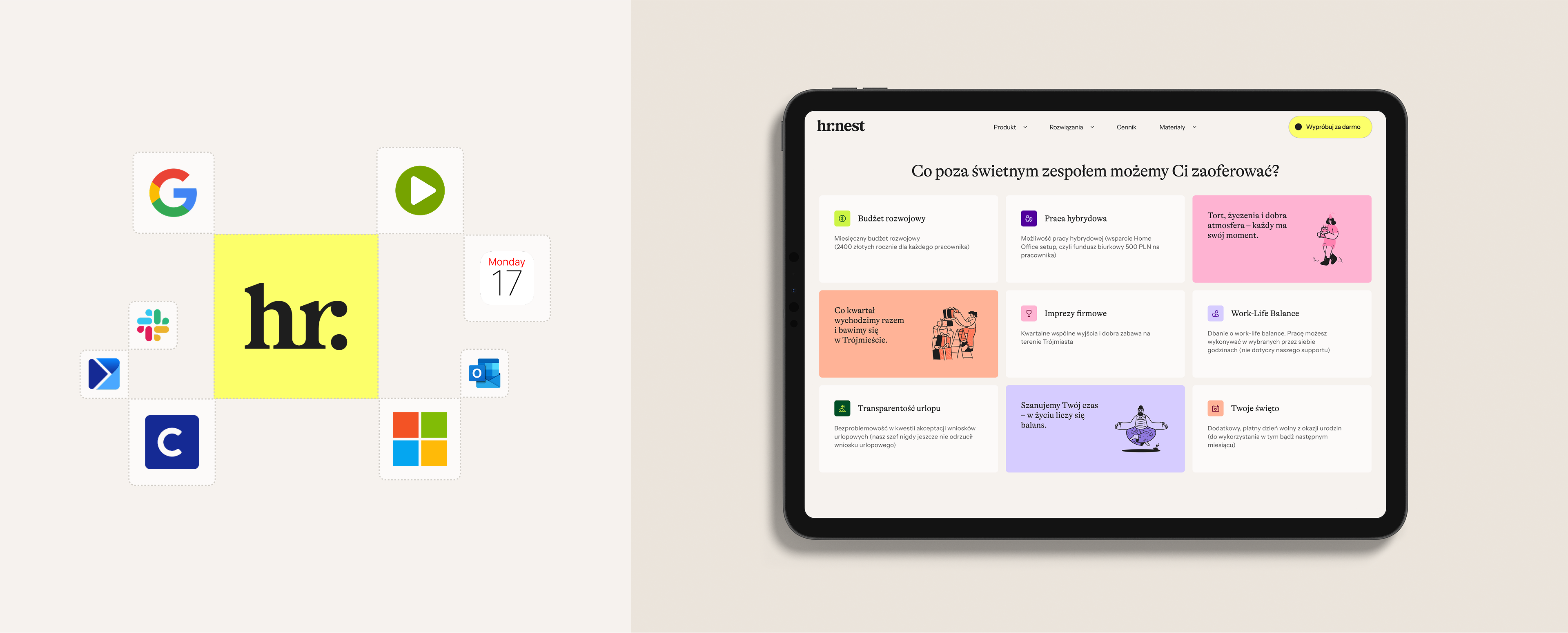
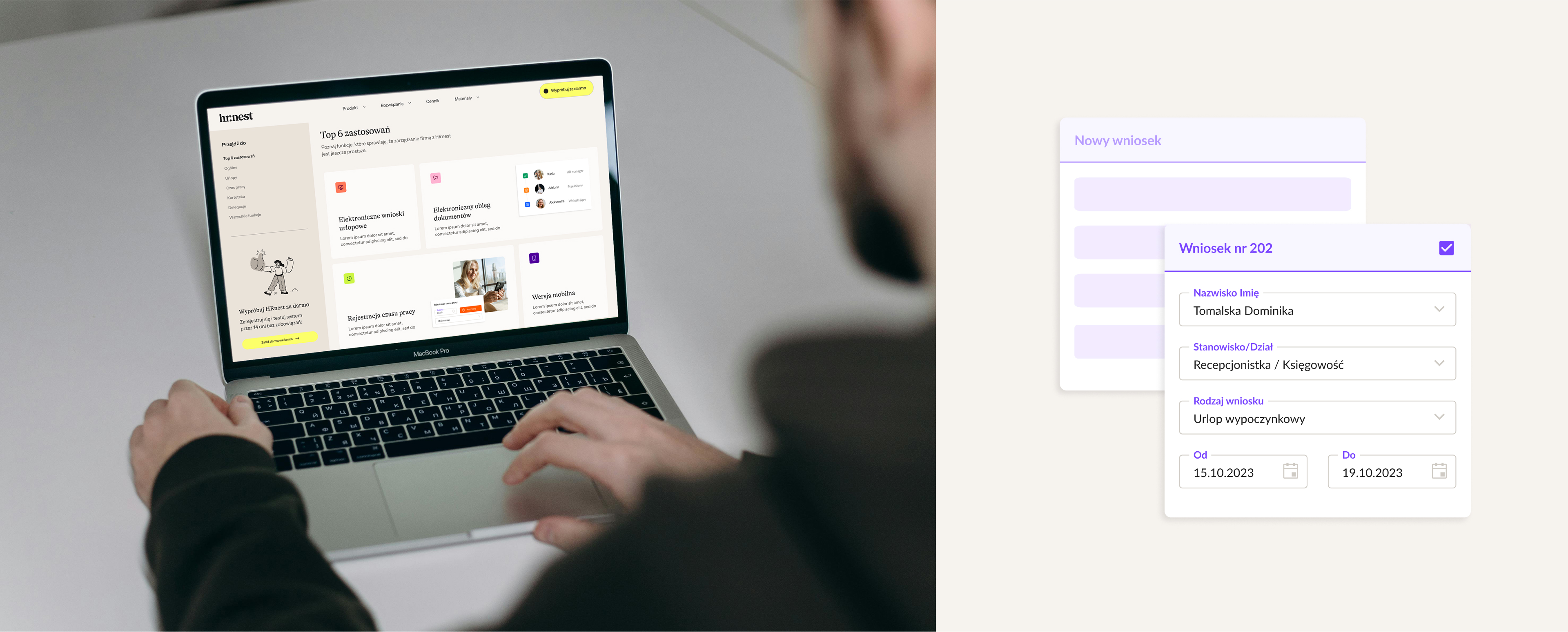
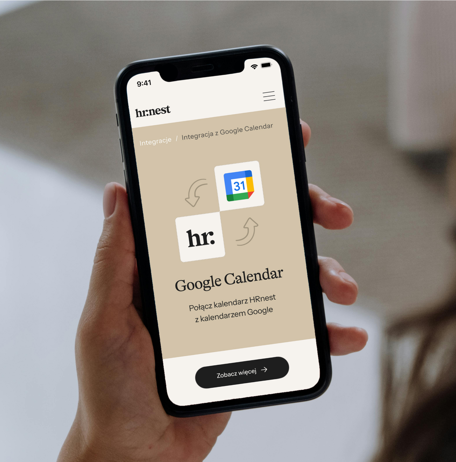
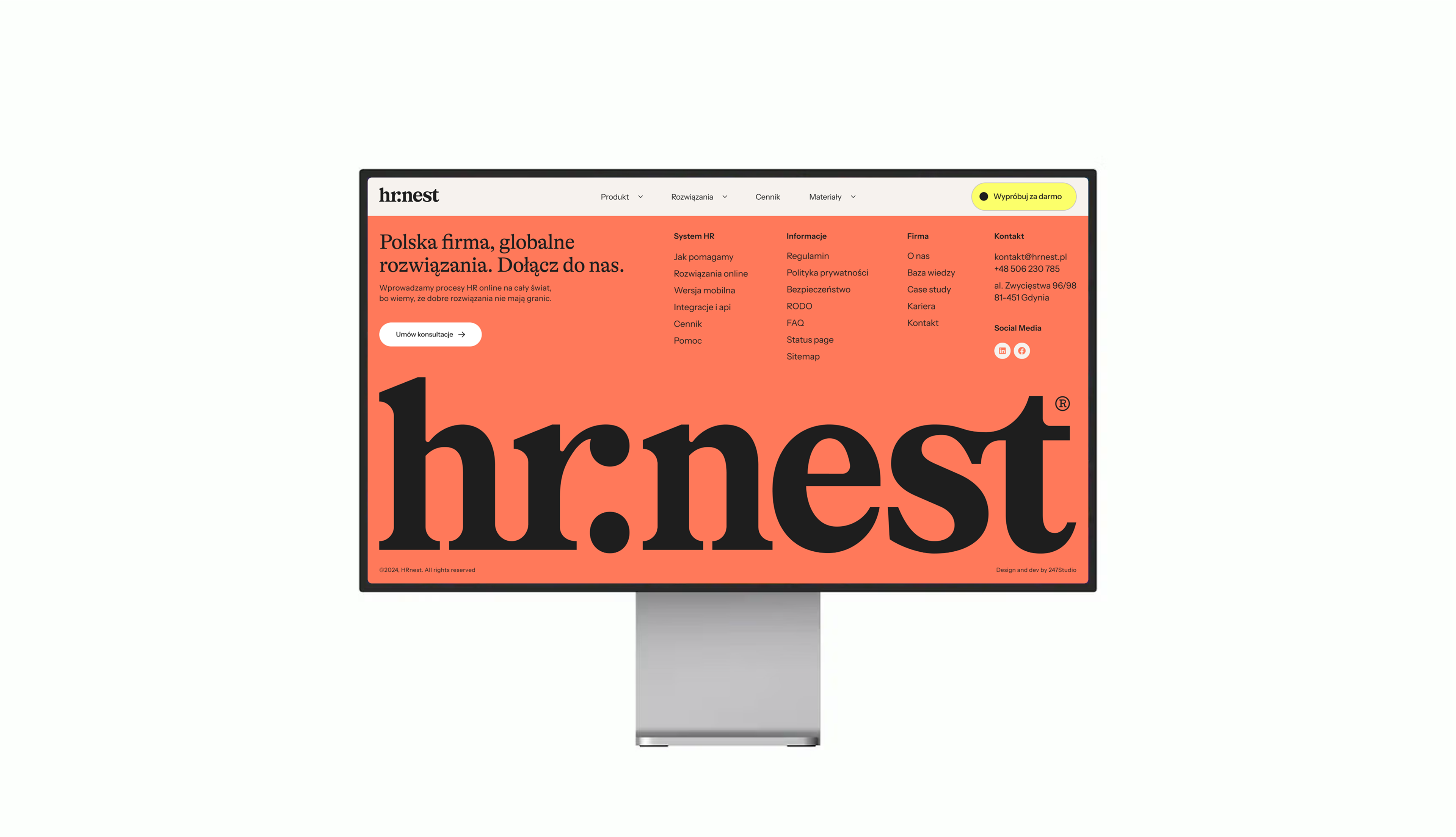
We started the work on the website with an in-depth knowledge of the HRnest system, which allowed us to plan a clear information architecture. This makes it easier for users to find themselves in the offer, and the messages are organized and readable. The key objective was to present the system's capabilities in an attractive and accessible way. We developed the structure of the website together with the client, based on knowledge about the motivations and purchasing decisions of the users.
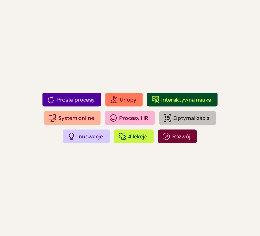
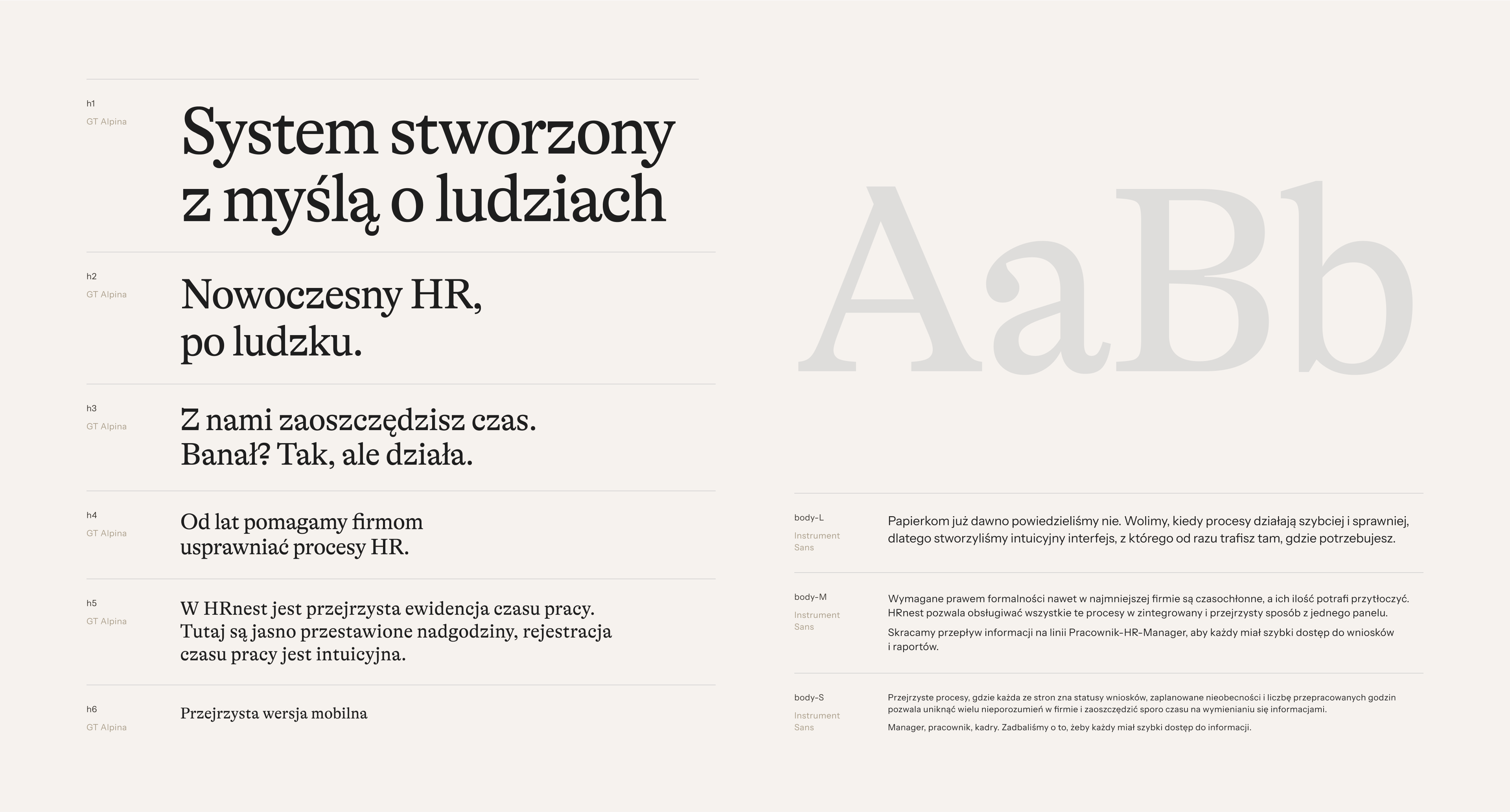
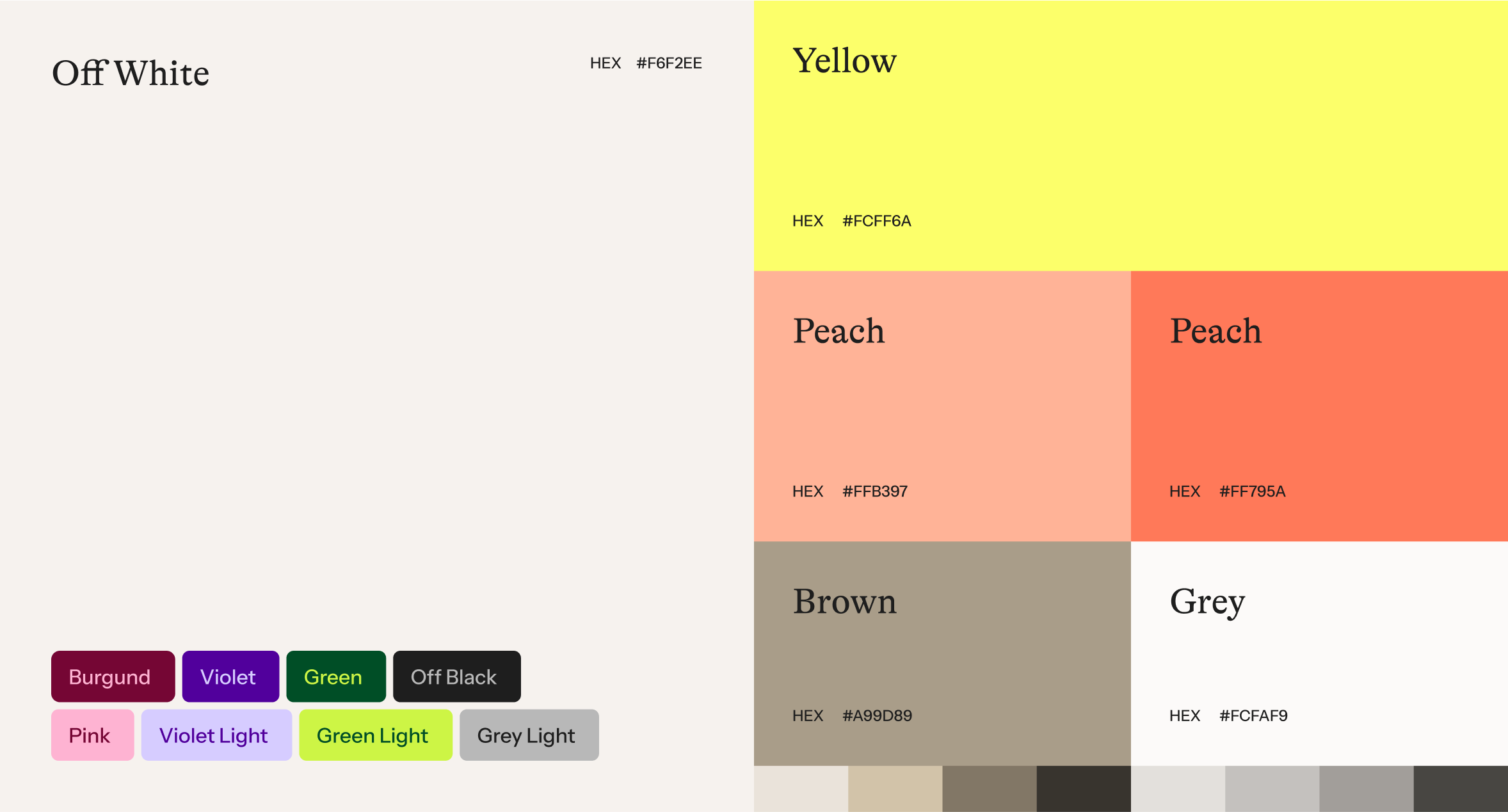
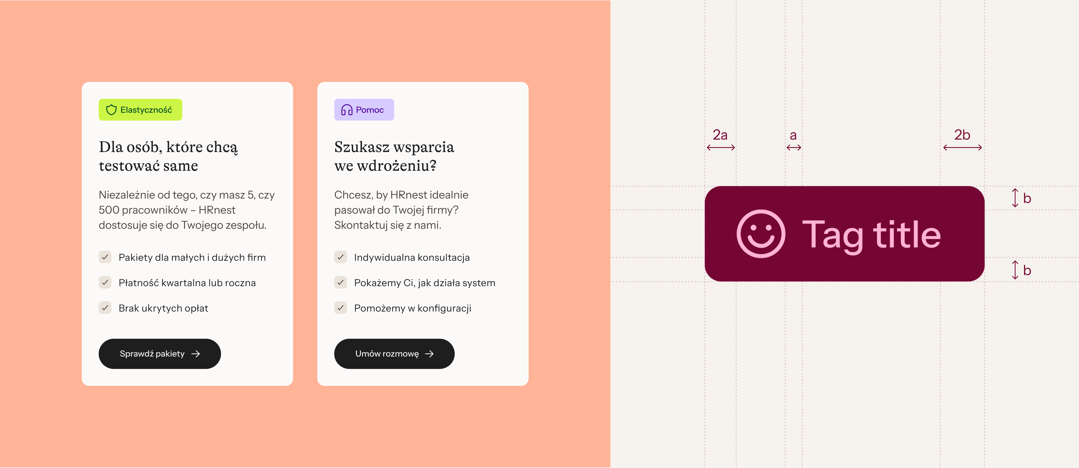
We took care of a clear layout, a consistent visual setting in accordance with the new branding and optimization of user paths. The interface has acquired a refined aesthetic and characteristic colors, reinforcing the brand recognition. The whole is complemented by author's illustrations and micro-animations, which increase engagement and emphasize the modern and at the same time human character of HRnest.
Result
Strengthening the visual coherence of the brand — from a refreshed UI system to a new website
Transforming HRNest into a mature, recognisable brand with an expressive, friendly and open character
Modern and orderly aesthetics emphasizing professionalism and ease of use of the system
Effectively showcase product features that enhance its appeal and encourage testing and purchase
A modern and transparent website that builds trust in the brand and supports sales objectives by presenting the value of the product in an attractive way and clearly presenting the complex functions of the system