Enova365 - ERP system for ambitious businesses.
Three brands, one architecture. A rebranding strategy for Soneta—a Polish ERP system developer with over twenty years of experience—encompassing the corporate brand Soneta, the established enova365, and a newly introduced premium brand. A project that transitions the company from its position as a "payroll and HR specialist" to a full-fledged provider of business tools for medium and large enterprises.
Zakres :
Klient :
SONETA
branża :
B2B SOFTWARE, ENTERPRISE TECHNOLOGY
rok :
2025
typ projektu :
Strategy, Rebranding
Soneta faced a challenge typical of growing organizations: a very strong and recognizable enova365 product, contrasted with a less distinct corporate brand and an increasingly complex portfolio.
The entire ERP industry—technologically mature but communicatively conservative—relied on similar visual codes and language, making it difficult for brands to establish a clear identity. The challenge, therefore, boiled down to two issues: organizing the portfolio into a cohesive ecosystem and creating the conditions to build a stronger market position for Soneta.
We proposed a new brand architecture in which Soneta serves as a strong corporate umbrella, with individual products assigned clearly defined roles, positions, and communication styles within the overall portfolio.
For our key brands, we defined distinct positioning, character, and communication language, while ensuring they all form a single, cohesive ecosystem. Soneta is built on the concept of "Coded Trust," while enova365 is centered on "Timelessness" and the promise of "Solutions for the times. Business in time."
The strategy was developed based on an analysis of audience segments, personas, and the competitive landscape. We complemented this with a set of practical tools—ranging from communication architecture and a Message House to verbal identity, strategic recommendations, and roadmaps for future marketing activities.
The client received a structured brand architecture that clarifies the relationships between their brands and establishes a cohesive framework for future growth and communication.
This strategy has enabled Soneta to better prepare its portfolio for subsequent stages of growth while preserving the strength and recognition of its existing brands. The new structure simplifies communication, reduces marketing fragmentation, and provides a consistent foundation for building the company's image across various channels—from product and partner communications to employer branding.
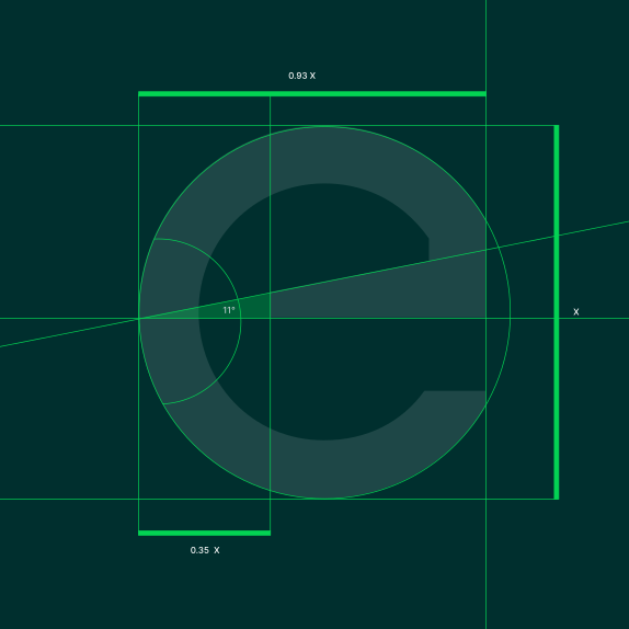
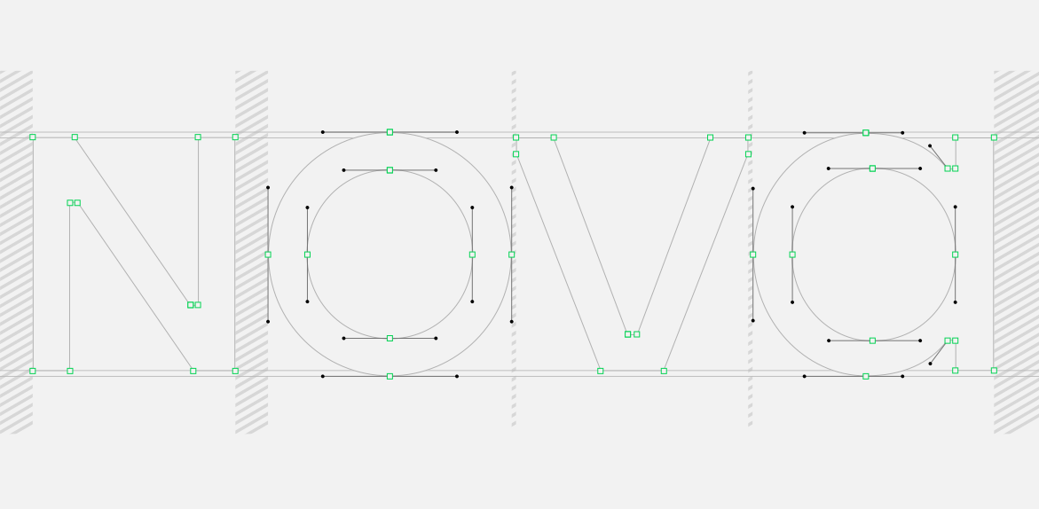
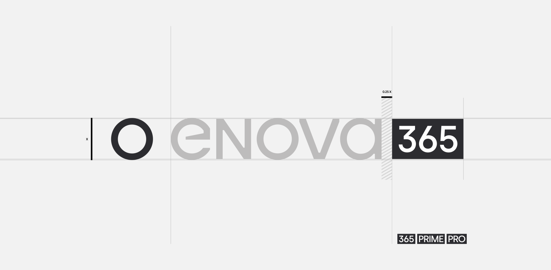
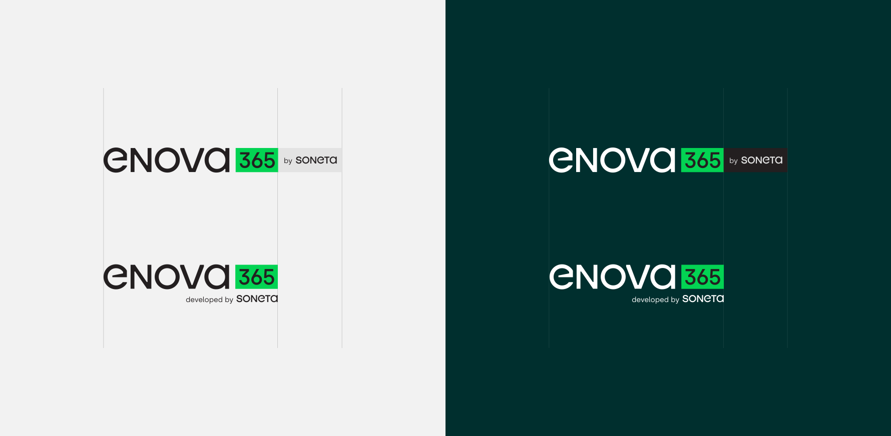







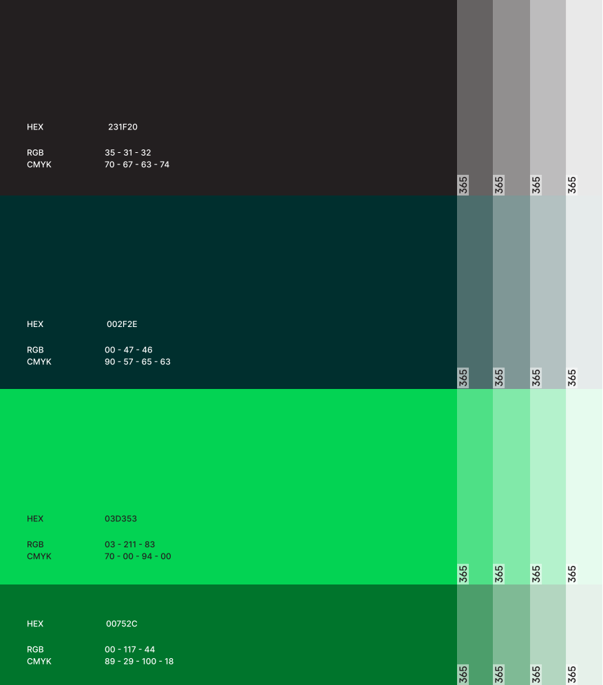
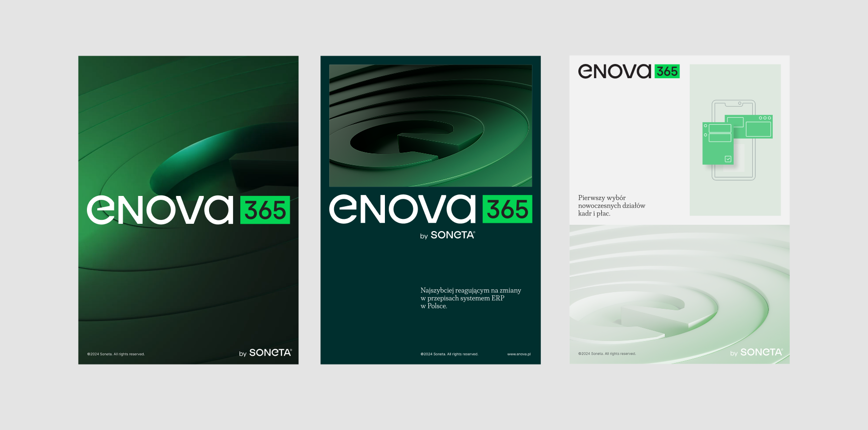
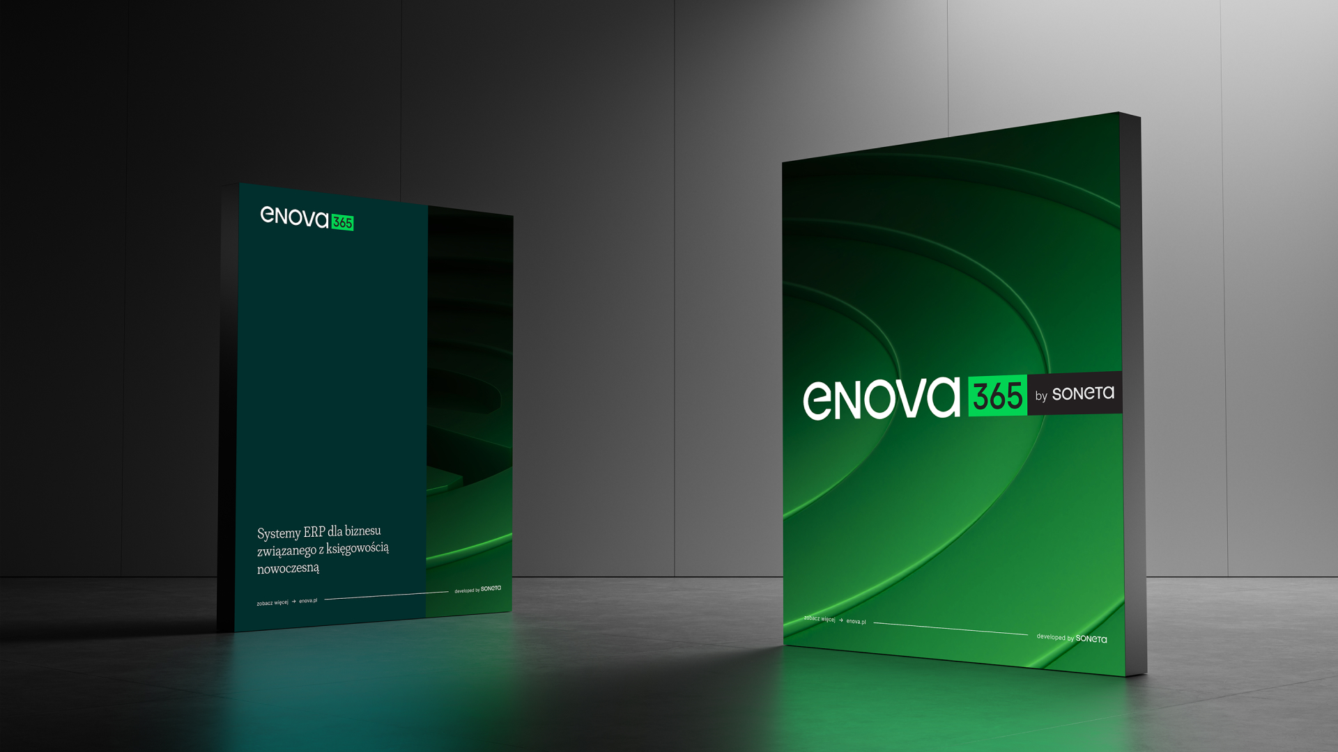
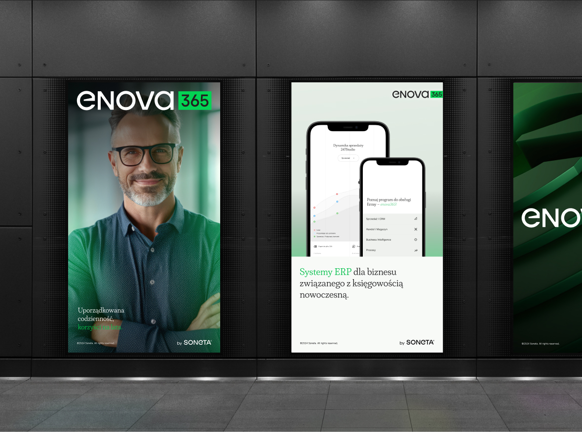
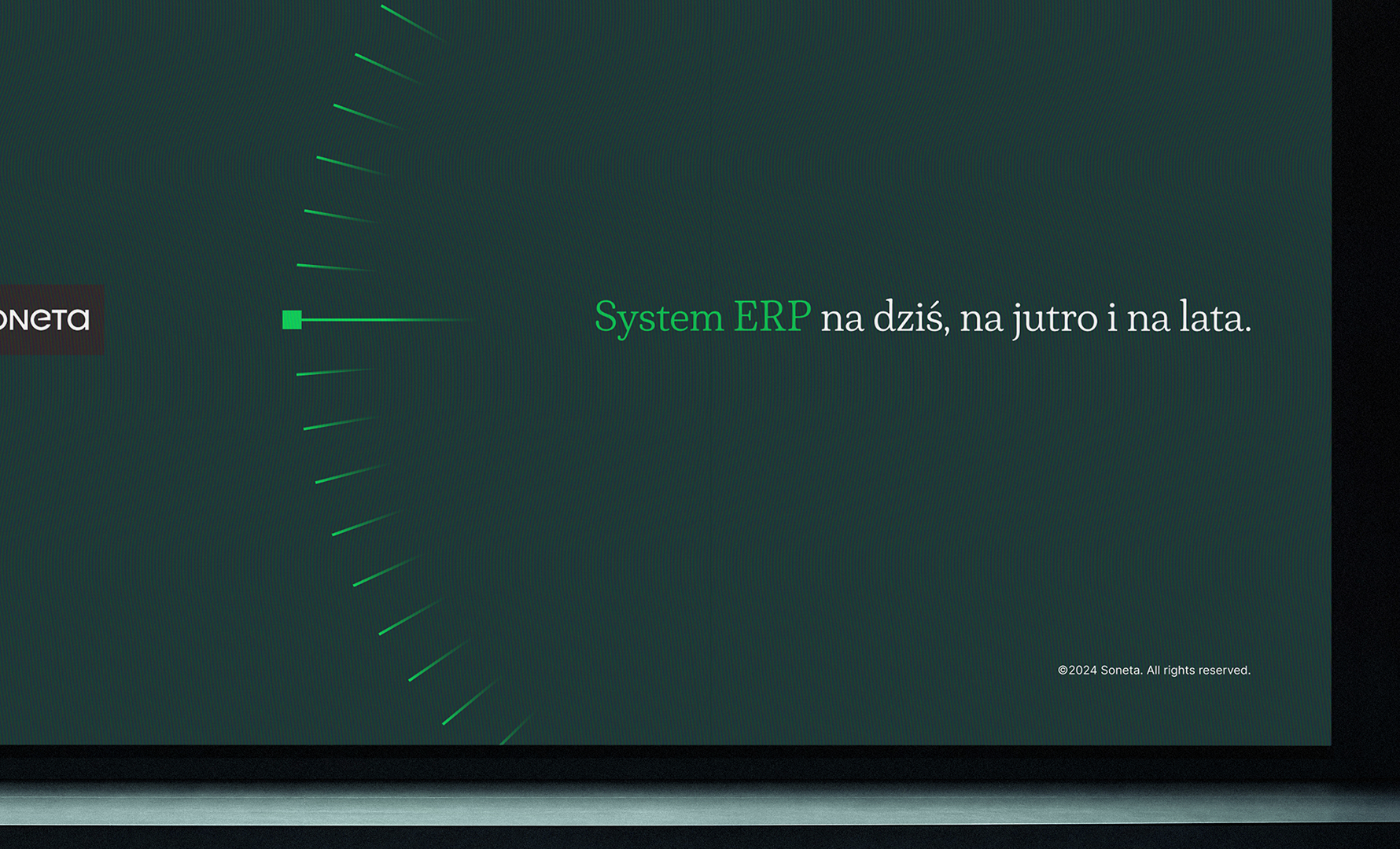
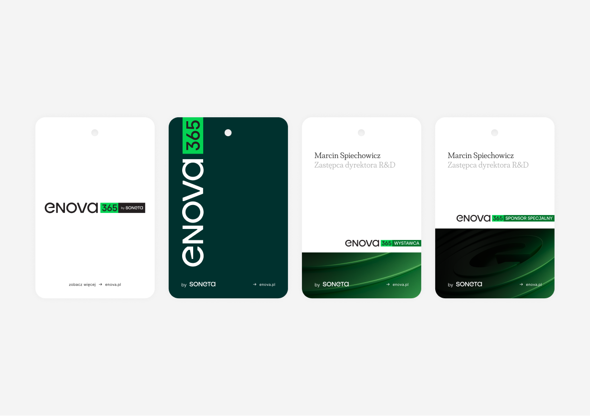
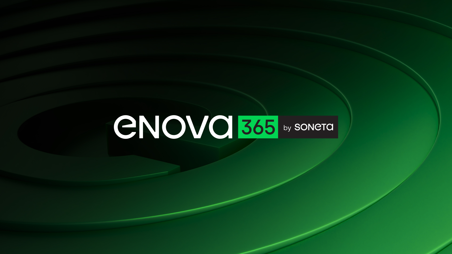
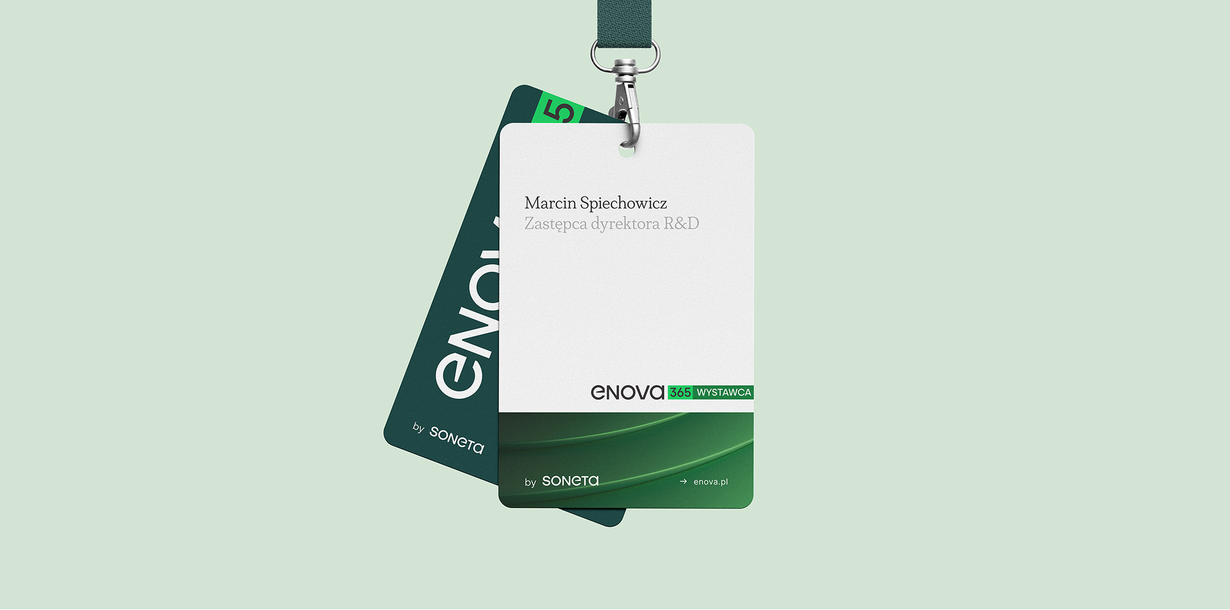
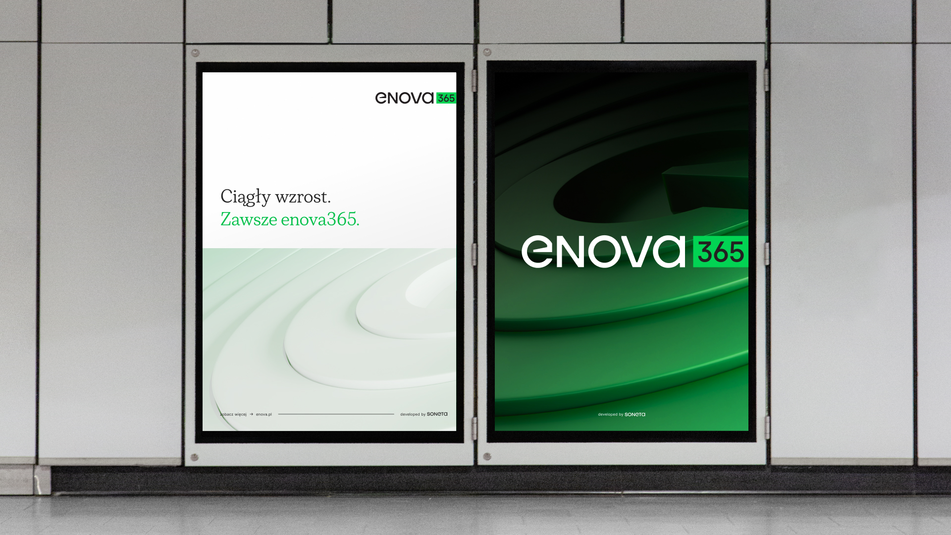
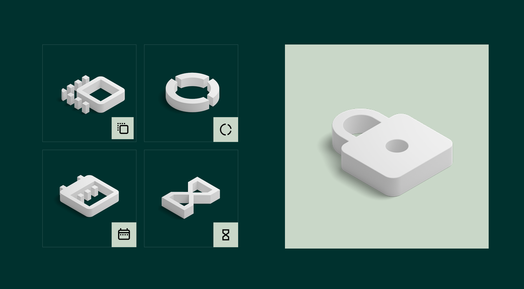
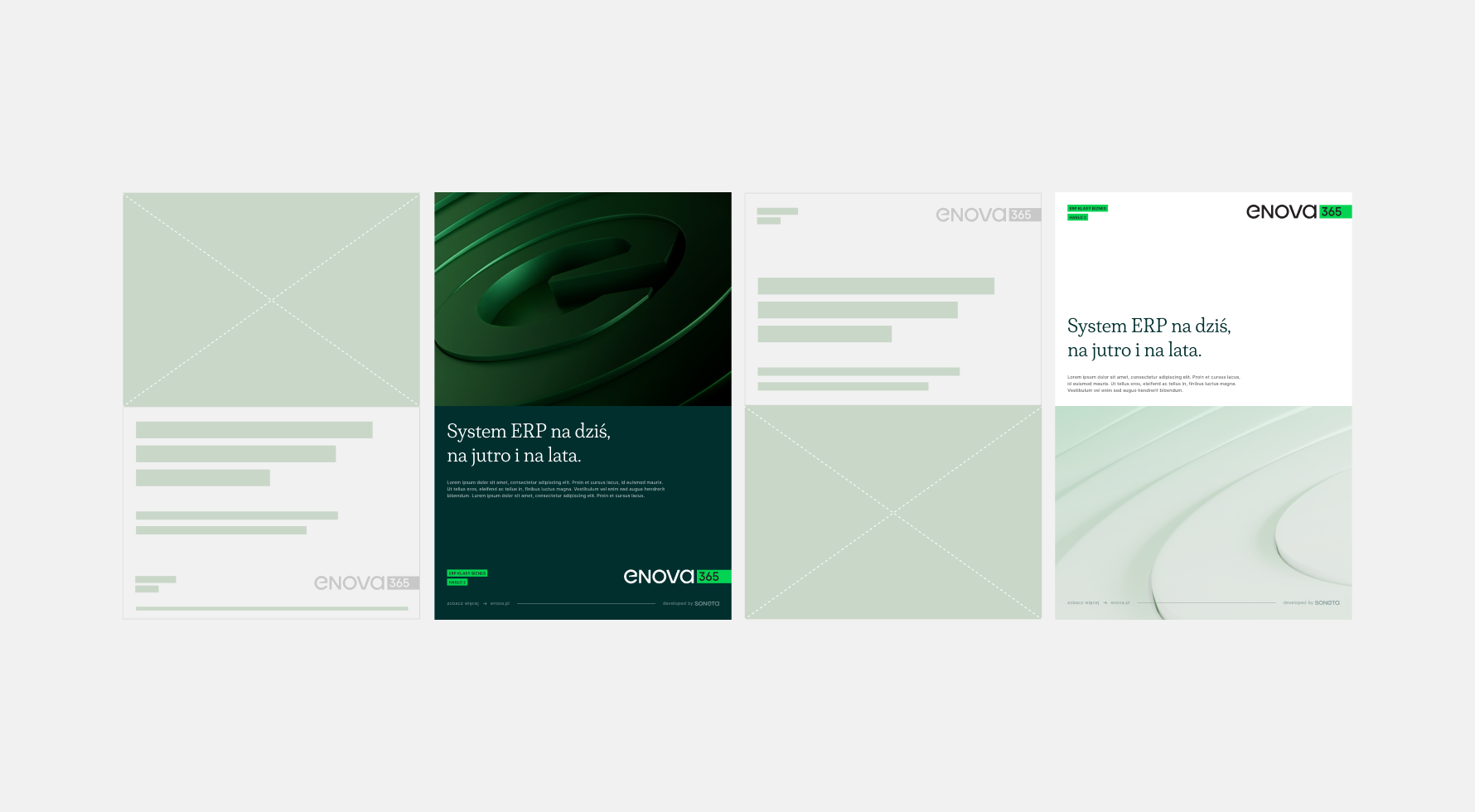
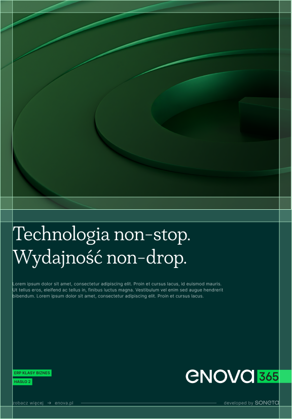
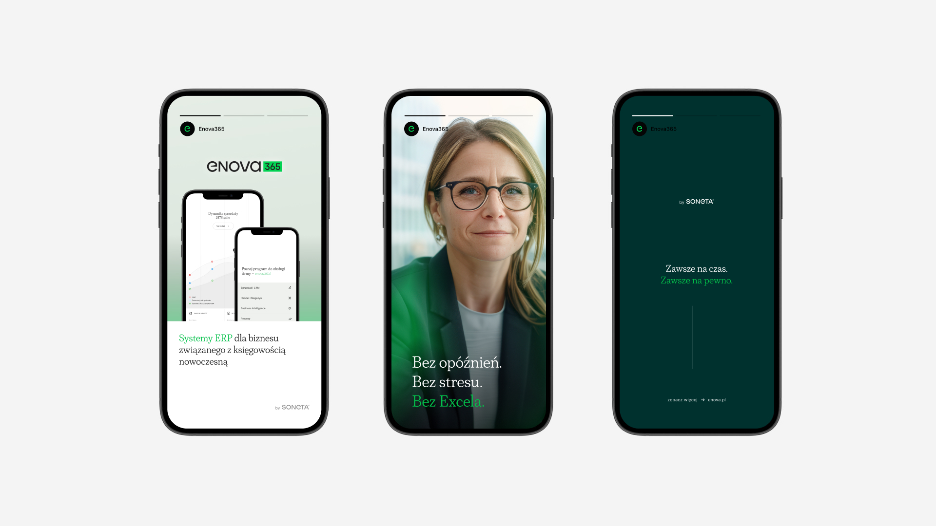
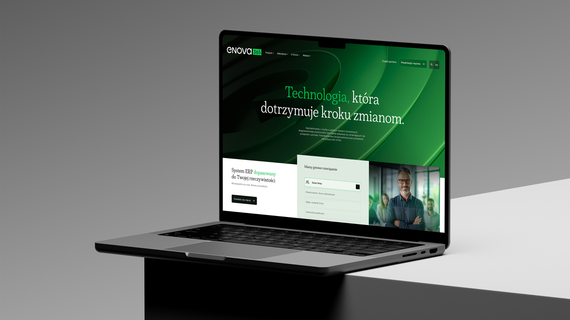
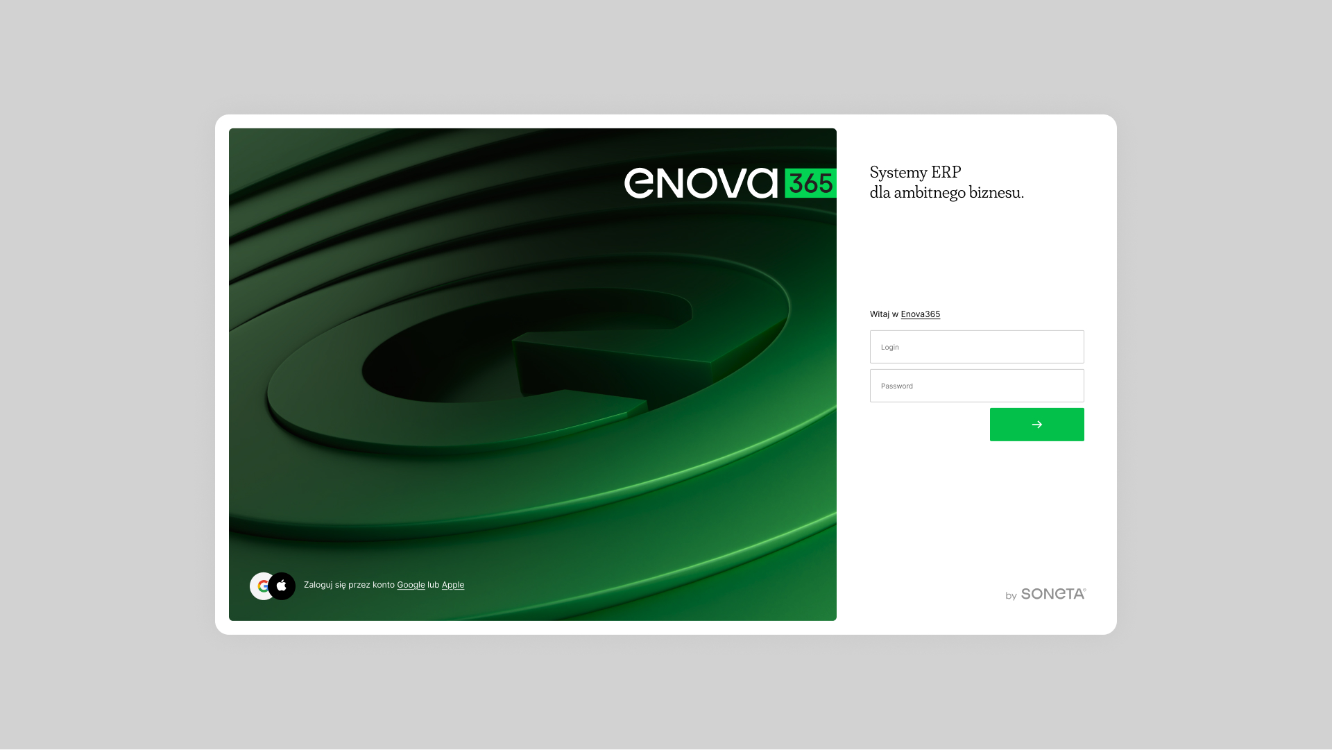
The enova365 brand color scheme is a result of the brand's visual evolution. It is based on green tones accompanied by white, gray, and black.





See other projects from our portfolio
Digital Design
Communication strategy
Web Design
Frontend Development
Visual Identity
full listing
kontakt +
.svg)