.svg)


Project overview
Challenge
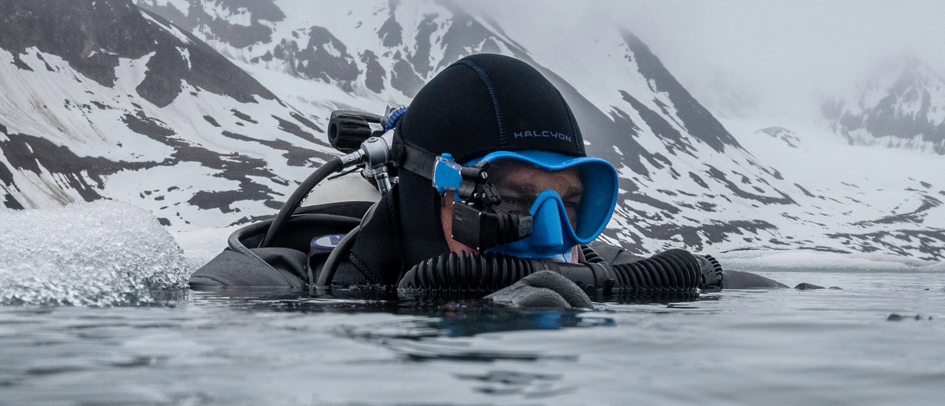
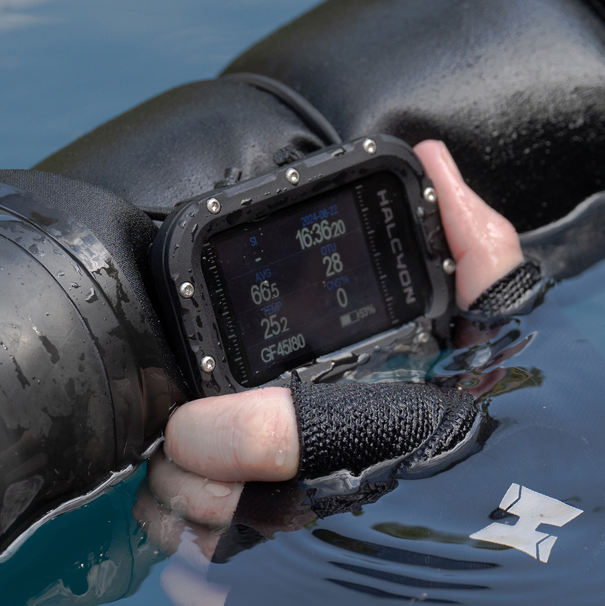
Halcyon is a recognizable brand in the world of professional diving, built on a solid heritage, engineering precision and loyalty of the diver community. Despite the technical advancement of its products and global presence, the brand began to lose its leading position, especially in the European market. The reasons? First of all, outdated visual identification, insufficient communication of innovation and lack of coherent support tools for distributors. Halcyon was seen as a brand for experienced professionals, not suited to the needs of younger audiences. The design did not convey the quality of the products, and the online presence did not confirm the technological status of the leader.
Solution 247
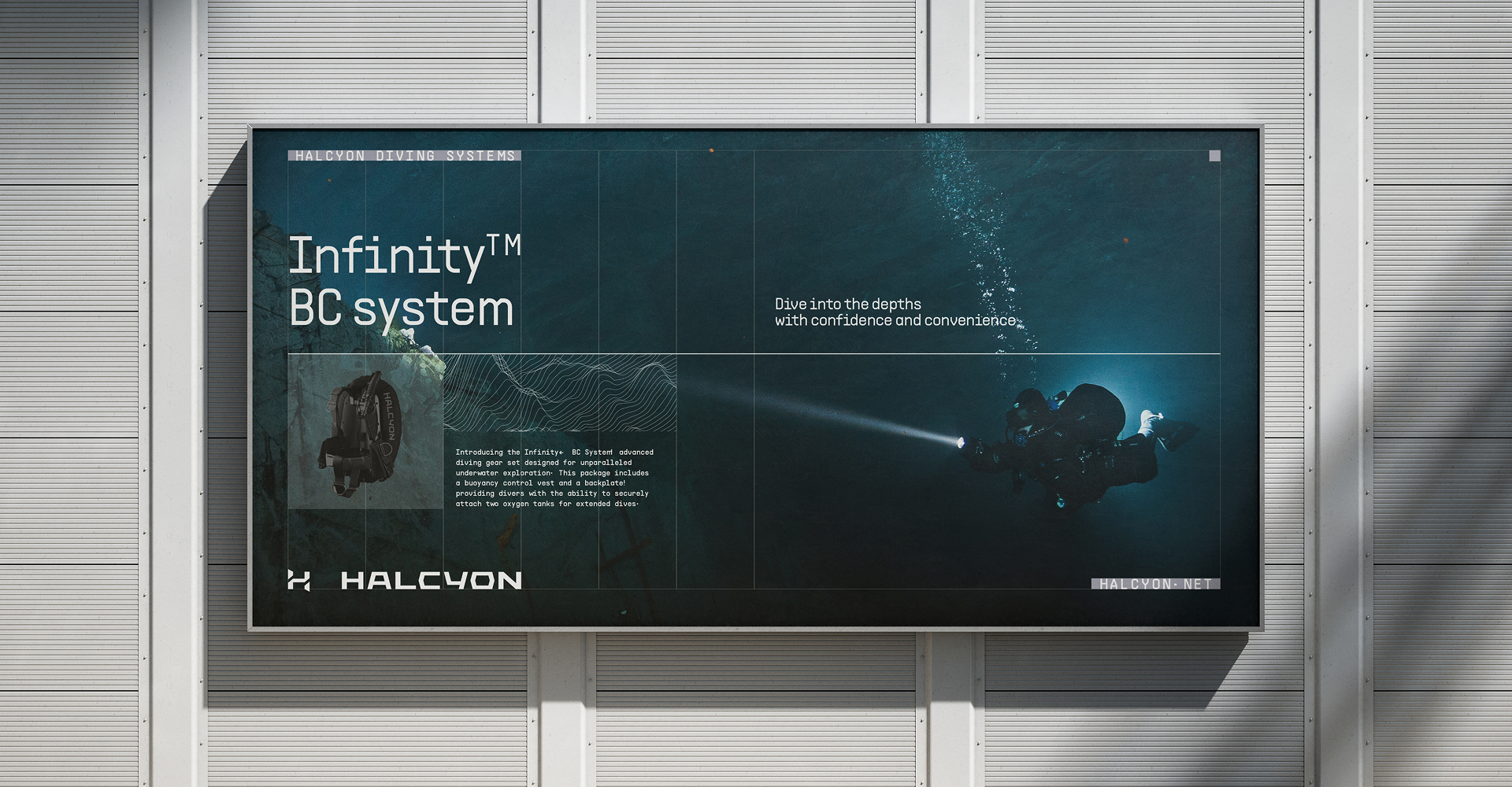
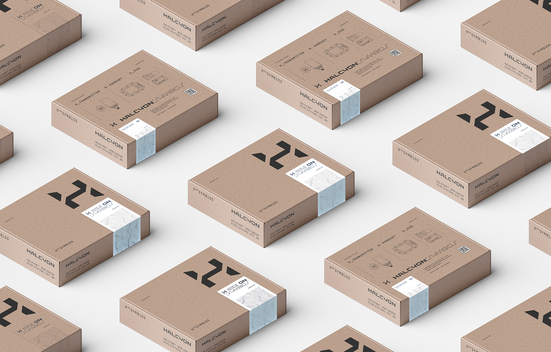
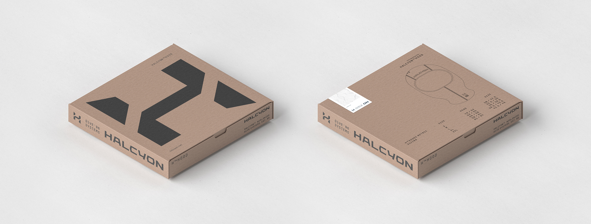
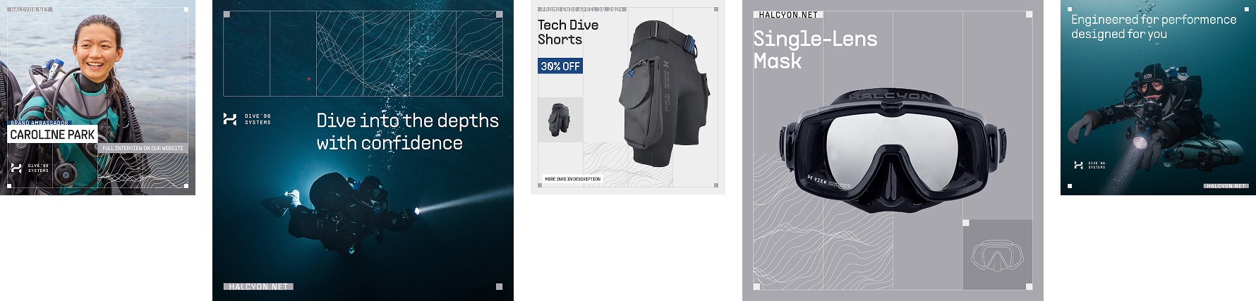
We started with an insightful visual audit, which became the foundation for further transformation. Our goal was to unleash the full potential of the Halcyon brand — restoring its leadership position and creating a modern, cohesive image that appeals to both existing and new audiences.
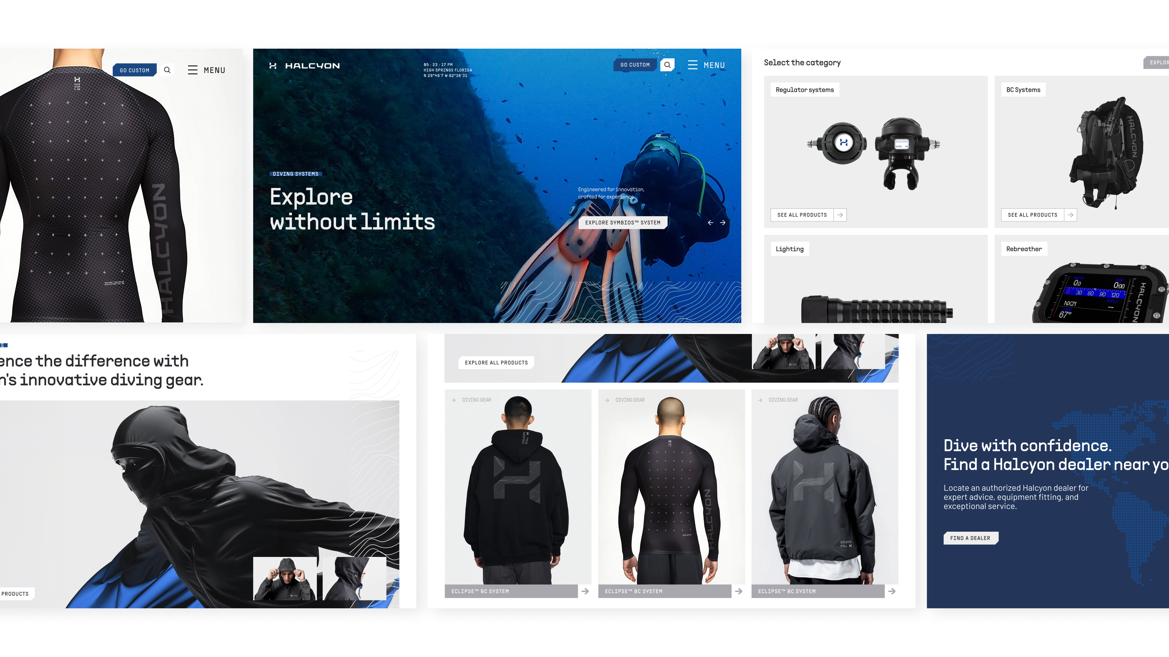
We have proposed a major simplification of the visual identification system:
organization of the logotype and its elements,
refinement of kerning and composition,
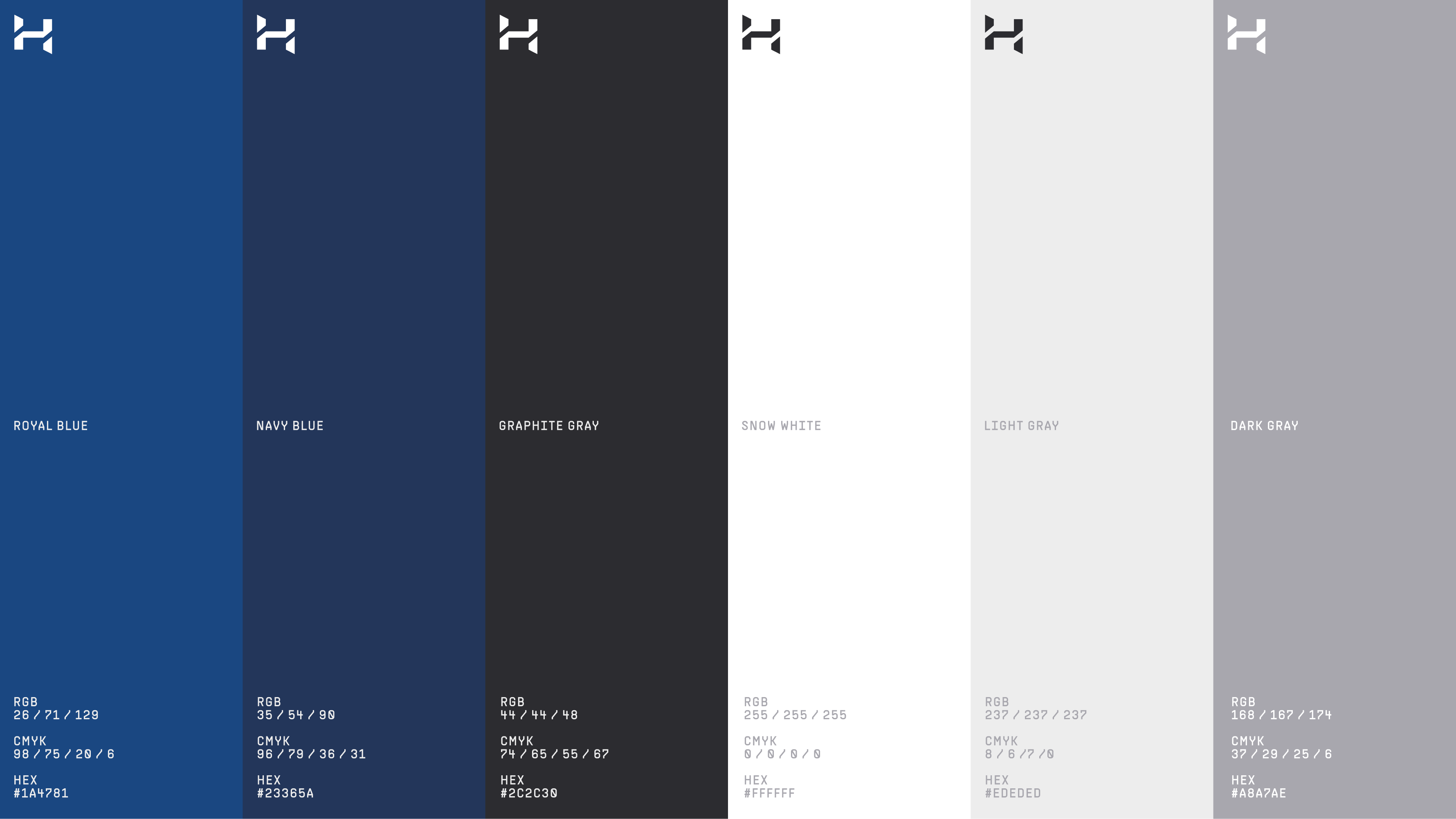
modernization of the color scheme with the preservation of the characteristic blue tone,
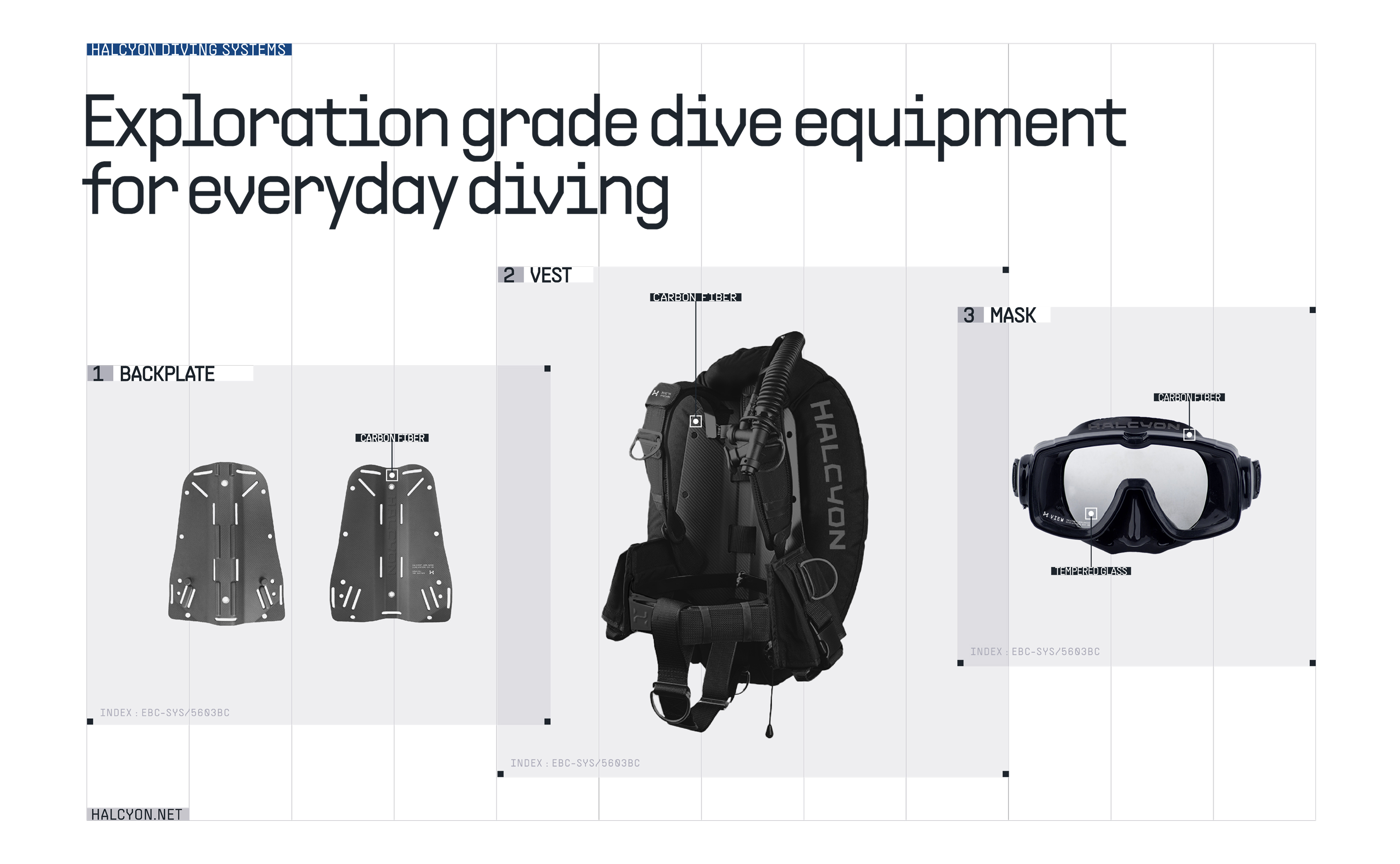
introduction of more expressive typography,
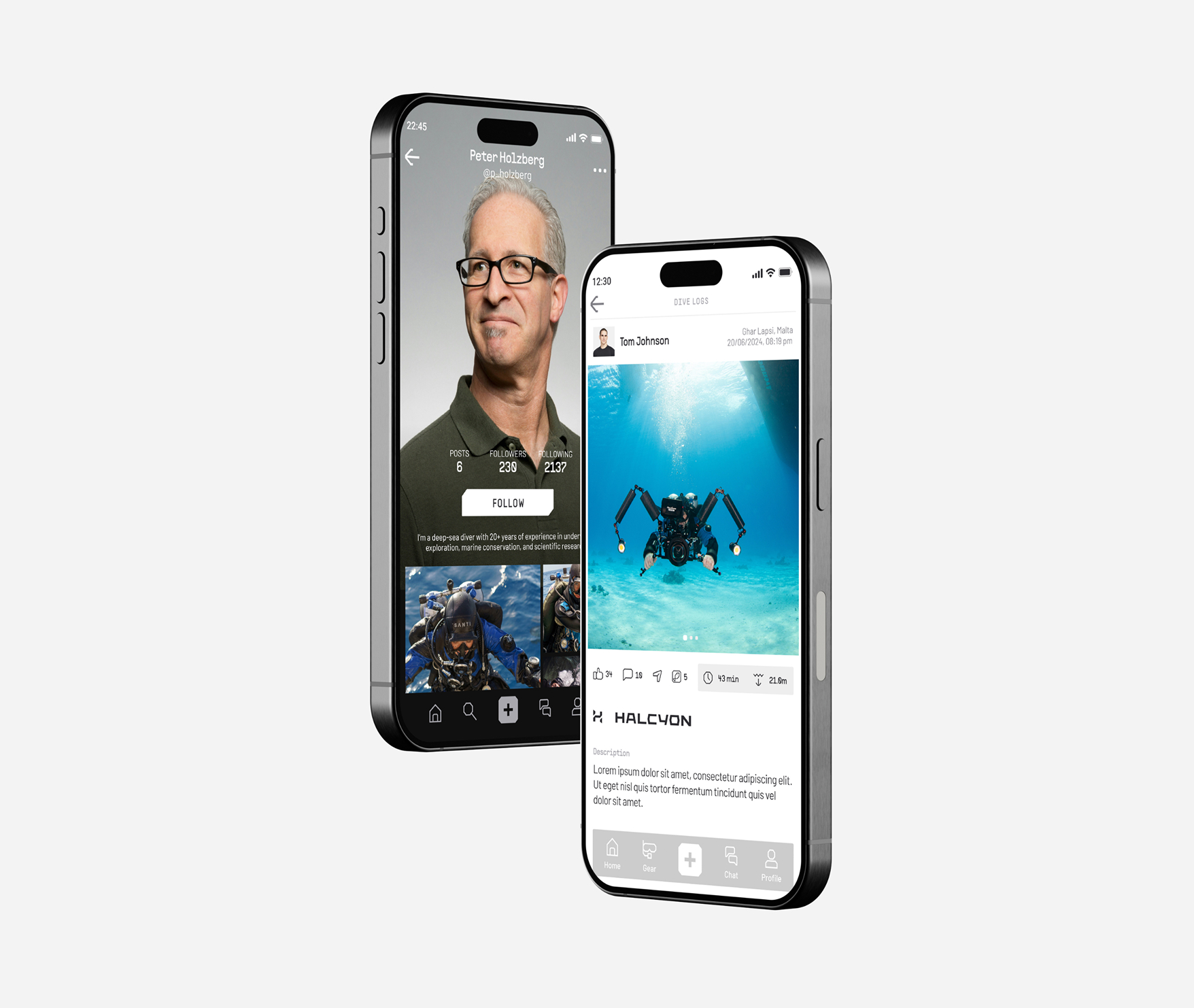
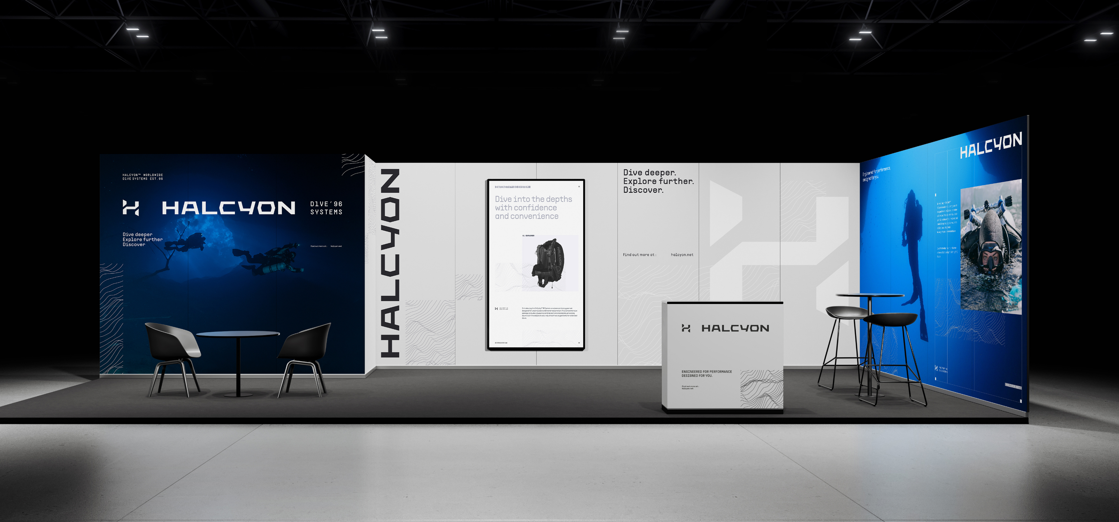
improving the quality of photos and renders,
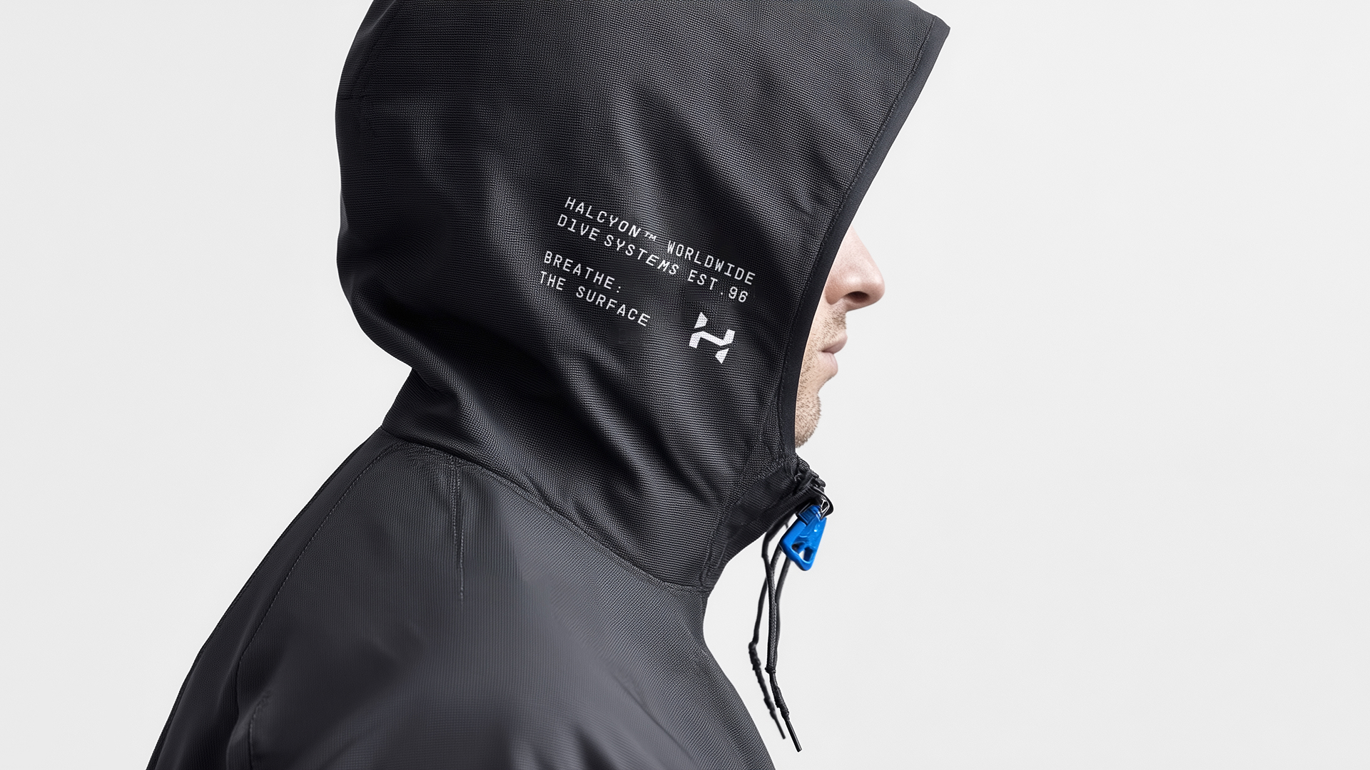
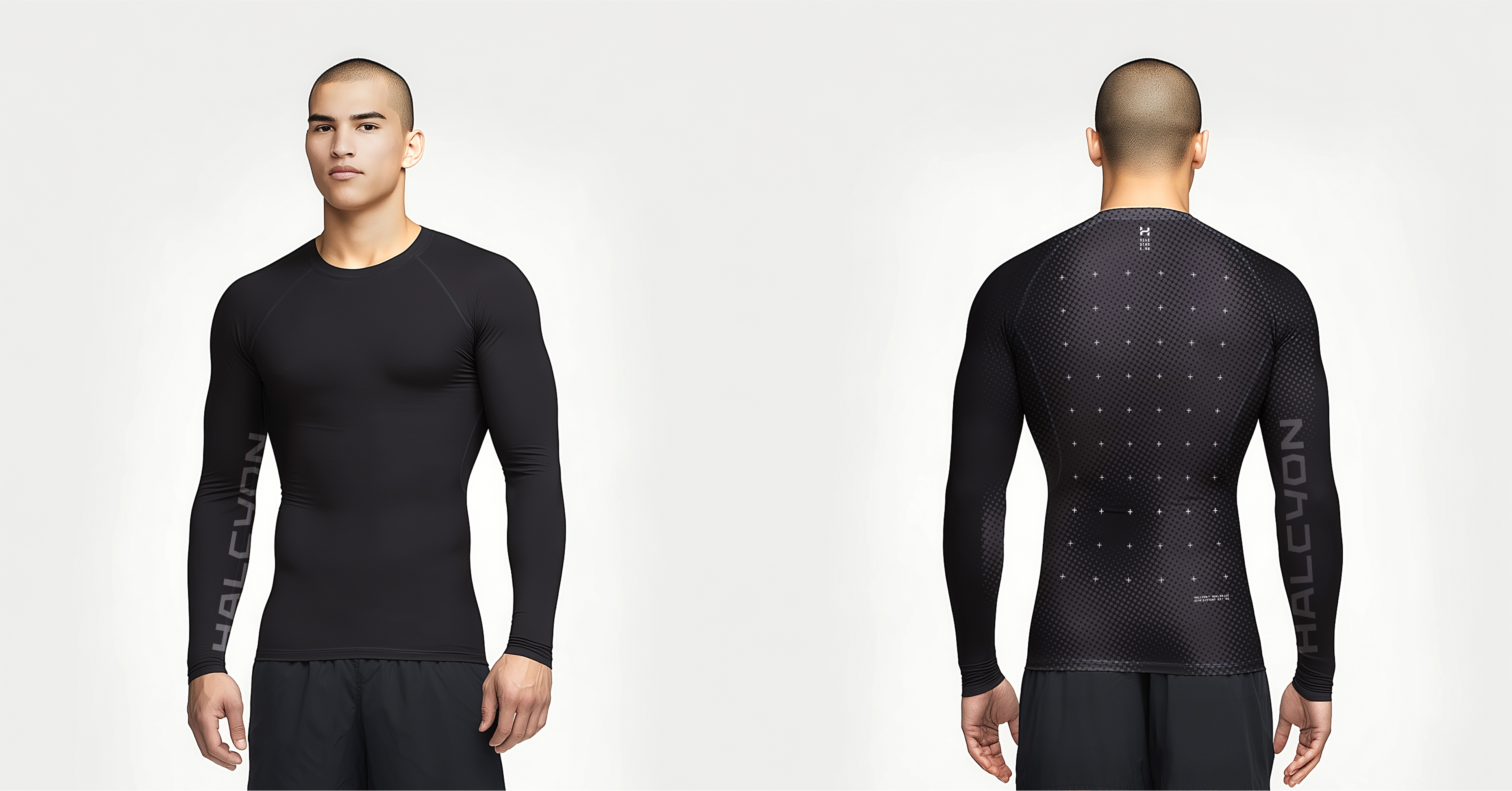
designing a new visual layer with movement, 3D and aesthetics in mind for younger audiences.
At the same time, we focused on strategic aspects: supporting distributors, emphasizing innovation and expanding communication with fashion capsule logowear collections. The key assumption was to create an identity that stems from heritage and knowledge, but is fully adapted to contemporary trends.
Result
Our work has become a catalyst for future changes — the brand has gained strategic tools to redefine its image. The visual audit indicated a concrete path for rebranding: a simplified, coherent and modern identification that not only corresponds to the quality of Halcyon products, but also goes to a new generation of divers. The brand has gained a clear visual direction that will support its global ambitions while strengthening relationships with loyal audiences. Thanks to this, Halcyon can re-emerge as a technologically advanced, stylish and inclusive brand — both above and under water.